VISUAL STUDIES / FILMS
Bad Apples
When the system rewards a child’s absence
In Bad Apples, the reading begins with an apple passing through a sorting machine, a teacher trying to control her classroom, and an image of absence that the school cannot reduce to a good result. This is a study of faces, doors and distances of power: a reading of what images say, rather than a retelling of the story.
From a system that sorts apples to a school measuring success through visible results, these images reveal a highly organized world into which a disorder creeps that assessment sheets cannot acknowledge.
Film posters
Four visual approaches to the same idea: fruit, title, face and the school setting.
An apple larger than the world beneath it
The yellow background opens up like a clean advertising space, while a decaying red apple occupies almost its center. Beneath the fruit lie a small outstretched body and scattered school belongings; the scale difference is deliberately absurd, so the image need not show the fall for us to feel its weight. The design turns the apple from a familiar school symbol into an enormous object threatening the person beneath it. Empty space around the scene increases its isolation and strangeness, while the red title at the base reinforces the shock rather than explaining it. It promises a comedy with a harsh visual logic that makes no apology for its contradiction.
The yellow system closes around a solitary seat
A relatively small woman sits between two rows of school desks, looking directly outward, her body offering no reassuring movement. Behind her, a yellow wall swallows the room’s details, and the large black title above her head becomes a second ceiling descending on her. The poster relies on symmetry: desks enclose the middle, and one person occupies the point where their lines collide. The irony is that the institution supposedly offering the teacher a space of control appears larger and more rigid than she is. Reducing disorder to a motionless body makes anxiety tangible before we know the reason for the silence.
An apple above a head that cannot command the frame
Most of the poster is given to a green background with a chalkboard-like texture, with the loud yellow title placed above. At the bottom, only a limited portion of the woman’s face is visible, while a spoiled apple rests on her head. It seems small beside the lettering but claims the center of attention. Deliberately cropping the face delays our recognition of the person in crisis and makes an ordinary school object more visually powerful than she is. The design combines the innocence of the classroom board with the color of rotten fruit, making the joke light in construction and unsettling in effect.
The teacher’s face confronts a restless color
This design replaces the apple with the teacher herself. Pure yellow fills the background without furniture or a classroom, and red letters dominate the upper space while the woman stands below in similarly red clothing. Her face, however, does not share the lettering’s vitality: a fixed gaze and a tight mouth interrupt the relationship between the noisy advertisement and the character’s reserve. The school identification card on her chest establishes her institutional identity even within this isolated image. The tension between colors that shout and a face that withholds helps define the dark comedy’s tone.
We read the posters as independent advertising designs, rather than treating them as frames photographed for the film. The readings do not attribute confirmed intentions to their designers.
Frame anatomy
Twenty-four selected shots, each carrying its own question and independent reading.
This visual order is not chronological: machine and face, darkness and light, room and open space alternate. Select an image to enlarge it, or follow each frame alongside its reading below.
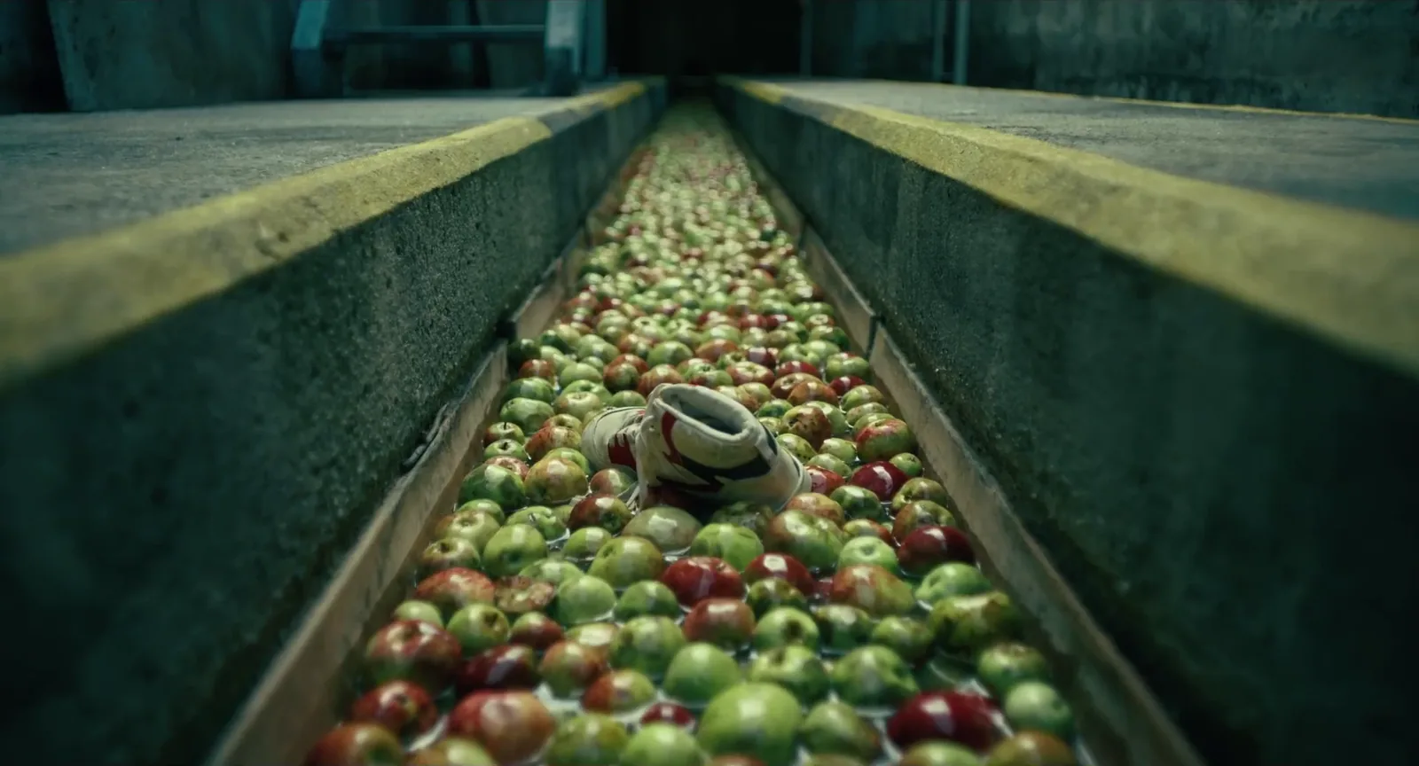
The shoe that disrupts the sorting line
The metal channel’s edges surge from the foreground into the distance, while green and red apples accumulate along the route like interchangeable units in a sorting system indifferent to individuals. A sneaker lying among them visibly interrupts that order: an object that should not be here, yet the lines keep directing our gaze onward as though nothing has happened. The satire lies in this simple contradiction between the machine’s precision and its functional blindness to the anomaly. Perspective turns the passage into an image of an institution that can keep operating even when what passes through it points to a failure that cannot be ignored.
The teacher sits where others are watched
Maria occupies the middle of the desks, but the seating arrangement does not make her a center of authority. Instead, she seems seated in a space usually occupied by others, while wooden surfaces rise like barriers on either side. Her direct gaze and rigid shoulders stop time inside a classroom supposedly filled with movement and noise. The furniture’s horizontal lines give the image a cold order, yet the lowered body disrupts its functional logic. What is unsettling is not visible chaos but its complete absence, as though quiet has become a condition calling for interrogation rather than providing relief.
A corridor with room for everyone except its teacher
The long corridor draws the eye into white and blue depth, while children gather along the left edge of the foreground, leaving Maria in a conspicuous gap between them and the repeated doors. Her hands are behind her back and her body partly turned, neither joining the group’s movement nor escaping responsibility for it. Windows and doors create a repetitive institutional rhythm, but the isolation of one body makes the place feel less orderly. The image can be read as a professional relationship founded on compulsory presence: the teacher is surrounded by her pupils, yet the space does not feel like hers.
A lit home and an eye left outside
Our gaze crosses the darkness outside to a sharply defined rectangle of glass. Inside are a bed, a chair, and someone moving near a table, all under seemingly familiar domestic light. The outer frame retains an enormous black area that does not let us enter what we see. This is what makes the composition effective: everyday details are available to observation but isolated behind glass and distance, like a silent display in which we cannot intervene. The image neither announces a crime nor shows violence, but it makes the relationship between inside and outside a source of tension: how much light is enough to make a home seem normal?
The performance that silences the person in charge
Pauline stands behind the keyboard, her back straight and her body directed toward the audience, while Maria sits on the left with her face resting on her hand, an exhausted gaze out of step with the child’s activity. A table and a heavy piece of furniture create visual separation between the bodies despite their proximity. Dense blue writing on the board extends the child’s presence into the background, as though her words have claimed the wall as well. The image works through opposing rhythms: one body launches into performance while the other stops before it, unable to bring it to an end. The classroom becomes a stage for a small reversal of power.
One sheet declares that everything is good
The frame needs no large results board to formulate its satire. A man in the background holding a sheet marked “GOOD” is enough, while a stern woman occupies the foreground and others look in different directions. The word is short and clear, but the faces do not agree on what it means. The composition connects an administrative judgment raised into view with human tension that the same sheet cannot measure. Even daylight makes the contradiction drier; no threatening lighting is used to draw out the drama. The image criticizes reduction through its simplest elements: a sign saying things are good and bodies that do not look entirely convinced.
A door handle between two contradictory roles
The door cuts across the image as a vertical barrier, revealing part of Maria in the opening as she holds the handle. A small school sign on the wood and paint identifies the class and teacher, an institutional marker that defines the place with complete simplicity. Yet the framing conceals almost half her body, leaving us unsure whether, emotionally, she is entering or leaving. Pale blue sits beside faded green, while the metal mesh over the window adds another layer of separation. Through ordinary signs of place, the composition asks about the distance between an announced role and what a character can reveal.
Pauline’s gaze steps outside the expected response
Pauline has a calm face and a gaze not aimed directly at the camera, while her classmates fade into shallow depth behind her. The selected plane of focus makes her fully central without movement or speech; her clear glasses do not conceal her eyes but make close observation visible. The green uniform connects her to the group, yet the isolated background gives her a different position within it. The image imposes no judgment on the child’s motives, but it lets us notice how attention itself becomes a form of power. What she knows, or seems to know, may count for more than any authority the school formally grants her.
A still face in a world that will not wait
Maria remains sharply defined on the left, while people moving behind her become blurred bodies dispersing in different directions. Her warm hat and colorful scarf seem more alive than the gray sky and pavement, but her guarded expression shares none of their comfort. The space behind her face offers an open route that seems unable to resolve anything; people continue their business without connecting with her. The contrast in sharpness creates an undemonstrative isolation, allowing the frame to suggest accumulated thoughts pressing on someone standing in public as though confined within her own attention.
The lesson threatened from within
Danny leans forward with one hand raised above his head, while a woman in the foreground answers with an open palm and a wary defensive movement. Behind them, educational letter cards are neatly arranged on the wall; their innocent order collides with the two bodies’ agitation and the emotion in the face. We need not know the words exchanged to read the contradiction: teaching tools have moved into a storage-like space, and approaching the lesson is now governed by an unequal relationship of power. The small yellow light gathers both figures into a cramped area, making instruction and resistance visible in the same movement.
A screen gives the basement a false window
Danny occupies a small part of the image before a television that casts cold light onto the wall, while bags and old belongings crowd the corners. The most defined light comes from a device showing another world, rather than a window offering a way into it. The low seat and rough space beneath the pipes make his body smaller than the objects around him, reversing the child’s relationship with the home. The place is not a refuge but a temporary space in which he learns to live with isolation. Strikingly, the image needs no physical restraint: it is enough to see where movement ends and virtual life begins on the screen.
Three seats and a face turning outward
Maria sits in the foreground with her body turned toward the edge from which we watch, while two officers remain behind the table in the middle and far planes. Their official hats rest on the separating surface, like symbols of office placed between people before discussion begins. Their different lines of sight refuse a conventional confrontation: the woman addresses an eye outside the group, while the officers remain enclosed within the table’s space. This visual distance allows us to read uncertainty in authority itself. The scene feels less like a final resolution than a moment in which questions are distributed among people who are not looking at the same thing.
Small bodies beneath a sky larger than the school
Rolling land and overcast sky occupy most of the image, while a small human line stretches near the lower edge, almost lost among trees and fields. The shot examines not one face’s emotion but movement’s relationship with space. The bodies follow a visible route, yet someone observing from afar may be unable to distinguish individuals. Distance makes the group a countable and observable unit, although each person carries a different experience that the wide view cannot capture. Nature offers more than visual relief here: it exposes the limits of any perspective that believes it understands everyone from the same distance.
Whoever owns the stage owns the time
Two female figures of different ages and sizes face each other on a platform decorated with glittering stars and a heavy green curtain. Maria leans forward while Pauline stands almost upright behind the keyboard; the small gap between their faces generates a conflict larger than the stage. Festive lights brighten the edges, but the bodies’ positions interrupt the celebration. Dark audience heads in the foreground remind us that the confrontation is no longer private: people are waiting for the performance to continue. The time the child retains onstage becomes an instrument of pressure, while the teacher appears forced to negotiate in front of everyone.
A hanging notice conceals the person behind the question
The notice seeking Danny occupies the center with sharp typographic clarity: the word “MISSING,” a child’s picture, and a request for information. An indistinct person passes behind the glass, its dirt and reflections interrupting direct observation. The composition puts the child’s absence on the plane nearest us while the person physically present retreats into a moving background. The image asks us to see the notice as more than information: glass separates what ought to be seen from what cannot be reached. Public acknowledgment of loss seems to have become easier than touching its cause or seeing those living with its effects.
Competence at floor level
The man bends below table level until its upper surface becomes a pressing ceiling above his head. He lifts his face sideways with anxious eyes, while the rest of the room’s occupants are visible only through furniture legs. What is striking is that a place intended for organized work imposes an uncomfortable bodily position. The adult no longer occupies his ordinary chair but hides or searches in a space owned by objects. The frame does not establish why he is down there, but makes the change tangible: a situation that might have been managed through speech forces someone to reduce his own size to deal with his surroundings.
A smile gives speech another image
A man and woman sit in a close two-shot on a broad sofa. He extends his palm while speaking, and she turns toward him with a look combining attention and ease. Their bodies meet on the same visual level without a barrier between them. Warm beige and brown soften the severity of the cold school spaces that dominate other images in the film. The value here is not an assumed romance, but the ability of a hand movement and a head angle to create a familiar space of trust, even if the surrounding dramatic context is more complex. This quiet moment gives relationships a human texture that satire alone cannot encompass.
A face enclosed by rain-streaked glass
Maria’s face occupies the right of the composition, enclosed by a rain-speckled window and cold light from outside. Dense shadow covers the nearer side of her face, yet the outline of her nose and eye remains visible enough to establish a fixed forward gaze. The droplets prevent a clear view beyond the car, turning the background into shapeless patches of light. Two layers constrict the image: the car’s physical enclosure and an exterior world that cannot be read. Silent waiting becomes a visible form of isolation without requiring music or an overt event within this still image.
Cooperation builds a city smaller than its makers’ hands
Small wooden towers spread across a table surrounded by pupils leaning into their work. Hands are divided between building and watching, while a teacher stands higher in the background, following events without monopolizing the action. Wood recurs in both model and table, connecting the real space and the miniature city through material. The image gives organization a different meaning from mechanical sorting: bodies are not pushed in one direction but share in making something that can be changed and repaired. The composition allows several centers of attention, as though a lesson succeeds visually when the teacher is no longer the only one with the final word.
A child behind the rail of a huge machine
Danny looks out from behind a metal barrier covering the lower half of his body, while hoists, pipes, and industrial lighting fill the ceiling above him. The place’s lines do not seem designed for a child: the metal is horizontal and rigid, and the large upper space is governed by mechanical detail. Almost only his head emerges above the railing, drawing us to his relatively calm features before we notice how the setting limits his movement. The image brings a difficult-to-contain child together with the engineering of an institution that knows only barriers and instructions, without forcing the frame to deliver a final judgment on either.
The missing picture behind a successful speech
Maria stands at one side before a microphone, warm light tracing her face and smile, while a red display behind her includes Danny’s photograph and text addressed to the audience. Positioning the poster behind the speaker creates two contradictory layers of presence: a body at the center of public speech and an absent face unable to speak for itself. A clapping hand enters at the edge, adding a social sign of the event’s apparent success. The image does not tell us what was said, but the arrangement of its elements is enough to create tension: who receives the applause when the most important picture has no voice?
A rest the face does not believe
Maria rests on her hand beside a wooden table, with pipes, shelves, and unfinished concrete surfaces behind her. Her shoulder contracts slightly and her eyes settle to one side, showing neither complete relief nor an immediate eruption. Cold light reveals the place’s details without warming it, and the space surrounding her is larger than her action. The basement can be read as an extension of continuous management: even when the body finally sits, the face remains occupied with calculating what comes next. Visual silence is not a reward for control but a reminder that attention has never left the confined space.
The paperwork rises above the person in charge
Maria sits at the right end of a long desk mostly covered by piles of papers and files. Behind her, walls carry further pages and notes with no clear order. She appears small within the supposed place of decision-making, while paperwork occupies the visual center of gravity. Pale green brings no comfort, and the even lighting makes administrative disorder look familiar rather than exceptional. The composition delivers its criticism without a speech: the institution produces more evidence and documents than it gives its members the practical ability to attend to anything that cannot be reduced to a form.
From above, every apple seems replaceable
From a high, almost vertical angle, we see apples lined up in a rectangle managed by machines on both sides. Individual organic details diminish before repetition, until each color difference seems a small piece of information handled by a larger mechanical movement. Unlike a close perspective that distinguishes a fruit’s surface and flaws, this elevated distance prioritizes the group’s shape and direction of flow. The frame provides a fitting end to the visual reading because it returns us to classification after the faces of children and adults. A system whose operations look clear and clean from above may, precisely because of its viewpoint, fail to see the story of any individual passing through it.
NOT THE END OF THE STORY
When apples are sorted from above, the machine seems certain of its standard. When we move closer to the human faces in Bad Apples, we realize that what is excluded from the image may be its most important part.