VISUAL STUDIES / FILMS
Clayface
The face between stardom and bodily matter
From a window that makes a body small to neon competing with a face, and from a treatment room to a mirror large enough for only part of its owner, the images of Clayface build tension around what can be seen and what is difficult to retain. Through an independent reading of every poster and frame, we trace how the value of the features changes between the image of stardom and the fragility of matter.
The closer we move to the features, the harder it becomes to find their owner; the wider the space, the smaller the body within it.
Five images promising transformation
The grooved face, white space, the gold frame, multiple faces and the window.
A face sliding out of its own image
The left eye retains its sharpness while vertical grooves pull the remaining features toward the bottom of the poster. Our gaze begins with a recognizable face, then stumbles over the red region where the openings of the mouth and eye merge with material that seems capable of flowing. This combination of stability and collapse makes recognizing the person an uncertain process within the image itself. The red title sits near the bottom, where the descending lines end, connecting the film's name to the face's fate. The frontal encounter promises horror close to the skin, in which a person's own image becomes the last thing they can hold on to.
White space opening inside a face
The eyes occupy the upper edge, but the mouth opens into an enormous white area that accommodates the title and most of the poster's empty space. Red surrounds this whiteness along the sides and bottom, allowing the image to alternate between an open face and a landscape enclosed by organic borders. At the base, a small person stands on a red expanse containing the outline of a city; the disparity in scale gives the face greater authority than the world it contains. The hierarchy draws our eyes from the gaze above to the name and then the small figure, while the whiteness makes the shock unmistakable. The design condenses bodily transformation into the disappearance of the boundary between a human being and the place swallowing them.
A portrait its frame cannot contain
The ornate gold frame gives the face the appearance of a portrait worthy of preservation, then the descending material breaks that promise by extending beyond the image's lower border. One side of the features holds together while the other opens into holes and elongated shapes whose colors mingle with the surrounding gold. The disturbance therefore moves from the depicted person to the system displaying them: what was meant to stabilize identity can no longer contain it. The red background becomes an extension that dissolves the distinction between the painting's surface and what lies outside it. The idea derives its force from this specific breach of the edge, where the image leaves its protected position and becomes material before us.
Many faces without a stable owner
Faces accumulate around a vertical axis, joined by glossy strands and masses that make it difficult to separate one head from another. The poster offers no complete principal face; even the central region is crowded with hands covering features, while the faces at the sides direct their gazes outside the composition. The copper color intensifies the sculptural impression, making skin look like a single material reshaped many times. The paradox comes from the abundance itself: the more faces there are, the harder it becomes to find a stable person behind them. Dark space around the group keeps its mass legible, preventing its branching forms from becoming visual congestion without a center.
A large name obscuring the city
The man stands with his back to us, raising his arms to a window crossbar, while its grid extends across the entire poster. Behind him, city lights scatter beneath a dark sky, and the red title crosses the middle of the glass on a scale that competes with the body itself. The pose presents someone facing the outside world, but the grid turns the breadth of the view into repeated closed compartments. The name stands between him and the city, making his publicly declared identity appear as another barrier within the composition. Unlike posters that move close to the skin, this design builds its promise through distance and obstruction; we infer the character's predicament from his position before the world before seeing his face.
These readings treat the posters as distinct visual designs, separate from frames of the film.
When an image cannot hold its owner
Twenty four readings of features, barriers, distances and texture.
Distances, colors and surfaces alternate in a visual order that is not chronological. Each image has its own title and reading; you can enlarge it and continue the tour within the viewer.
A window measuring the body's smallness
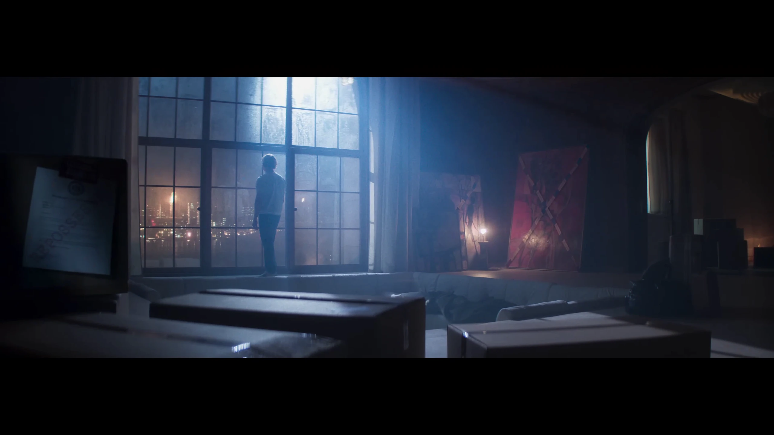
The tall window occupies the heart of the space, its crossbars distributing blue light around a small figure standing with his back to us. In the foreground, furniture remains as dark masses that interrupt our path toward the man, while a warm point of light beside the right wall does not alter the scene's coldness. This arrangement creates two successive distances: one separates us from the body within the room, and the other separates him from the city beyond the glass. The spacious setting therefore becomes a burden on his presence. The shot gives isolation a visible measure: the person's size is confined within a luminous rectangle, and everything around him exceeds his ability to fill the image.
A face occupied by display lights
Neon lettering competes with Matt's face from the left, and a bright vertical strip divides the area beside his features, while green spills over one side of his head and red over the other. The glass never settles into a clear boundary between a reflection and an image behind it; letters, face and merchandise overlap on one crowded surface. This suggests an identity obliged to compete with the place's displays simply to remain visible. The frame's strength lies in the way its confusion never entirely erases the eyes, keeping the attempt at recognition alive amid the colored noise. Commercial light takes space away from the person and makes his appearance conditional on passing through a layer of signs.
Treatment framed by its instruments
We see Caitlin through obstacles close to the lens, most prominently the dark ring occupying the right foreground. Deeper in the image, the doctor extends her arms over a reclining body, enclosed by the device's arms and the vertical lines of the blinds. This arrangement creates the feeling of observing a procedure we cannot enter; the instruments establish the room's function while separating us from the human being receiving treatment. Warm backlighting makes faces less easy to read than bodily outlines. The frame's ethical distance emerges from its distribution of visibility: we can understand the medical action, while the patient's face remains less prominent than the system working above him.
A face losing its familiar orientation
The eyes appear near the bottom of the image, while the open mouth and the stretched surface of the face extend upward. This inversion makes the features difficult to read; we must mentally reorganize them before recovering a person within them. Extreme proximity intensifies the distortion, removing most of the setting and leaving no visual space to soften the skin's presence. The eyes retain a degree of personal expression even as the vertical extension pulls the rest of the face toward a less stable form. Horror arises here from a visible struggle between two organs that help us recognize a person and material redistributing their features outside their familiar arrangement.
A city tilting around the spectacle
Building facades and illuminated billboards tilt around a crowded red area below, making the city seem to wrap itself around the spectacle it hosts. The elevated viewpoint offers an extensive view, but turns individuals into points that are hard to distinguish against the enormous advertisements. Bright rectangles compete for our attention while the red platform remains a more concentrated center of color. The shot creates a paradox between the event's importance to those within it and its smallness inside the city's visual machinery. The tilt adds unease to a celebratory scene, allowing its glamour to be read as spatial pressure surrounding people from several directions, even before we approach a single face.
Two seats without shared reassurance
Caitlin sits on the left with a straighter back, while Matt leans forward at the edge of the opposite sofa. Empty floor extends between them, made more conspicuous by an unoccupied chair in the background; the conversation belongs to two people, but the setting gives it a third interval that nobody occupies. Backlighting makes the figures similarly dark without erasing the difference between their postures. This disparity can be read as an unequal need for the encounter: one body retains its position, while the other pushes toward the person opposite. Medical objects at the sides continue to remind us that this personal approach takes place within a treatment relationship with its own boundaries.
Green enclosing the route out
The ceiling beams repeat low horizontal lines above the man, and walls crowded with writing direct our gaze toward the orange staircase in the background. Green floods most of the corridor and jacket, almost merging the body with its surroundings, while the exit retains a clear contrasting color. The composition places the character between two directions: his body moves into the depth while his head turns backward. Perspective therefore offers no reassuring route to the end of the space; the backward glance redirects some of the tension toward us. The color difference promises another place, but the low ceiling and long corridor make reaching it less straightforward than its clear visibility suggests.
A small blade at the center of fear
The small scissors and hand occupy the sharp foreground, while Matt's face retreats into a less distinct plane behind them. The metal sits close to the axis of the nose, turning the short distance between tool and skin into the main object of our attention. Cold walls press in from both sides, offering no spaciousness to dispel this unsettling proximity. The image's force lies in its economy: an ordinary object that a few fingers can hold becomes larger than its physical size because of its position before the eyes. The face retains perceptible tension despite its reduced clarity, dividing our attention between watching the tool and trying to understand the response of the person about to direct it toward himself.
A smile beneath a ceiling of bulbs
Matt smiles in the foreground as rows of bulbs above him recede toward a distant point on the left. Phones and faces crowd behind his shoulders, but remain less distinct than the face for which the space has been reserved. The composition repeats the logic of a public display: one recognizable person, with an audience becoming a frame that witnesses his presence. Warm lighting softens the skin in contrast with the sharp bright lines surrounding it. The smile looks convincing as an image of success, while the ordered bulbs and cameras reveal that this success requires a stage prepared in advance. The face gains its value here from everyone looking toward it at the same moment.
A hand unable to hold its own material
Soft material gathers between the fingers, then descends in thin strands beyond the bottom of the frame. The softly blurred turquoise background gives this detail a clarity that almost isolates it from the rest of the world, while the torso on the left remains outside the center of attention. The tension concentrates in the act of grasping itself: the fingers bend to collect something, but what they collect continues to escape. The hand, ordinarily an instrument of control, thus becomes the place where the impossibility of control is revealed. The image draws its effect from texture and the direction of flow, without needing a frightened face to explain what we should feel when material loses its cohesion.
A small body at the circle's edge
The staircase's rings follow one another around a bright central opening, while a dark body appears at the edge of one level on the right. The circles give the eye a clear geometric system, but placing the person outside the center turns their regularity into a means of emphasizing his smallness. The cool central opening contrasts with the warmer surrounding rings, intensifying a depth that cannot be reduced to a decorative surface. What matters here is that the person does not need to occupy the composition's middle to become its source of tension; his slight departure from symmetry is enough to return us to his presence. Architecture changes from a background into a bodily measure of height and exposure.
A readable gaze facing a closed back
Caitlin faces the camera on the right, while Matt gives us his back and shoulder in the left foreground. The composition lets us read her eyes and her attention toward him, but conceals his response, leaving the exchange incomplete for us. Behind them opens a grey courtyard that appears wet, with columns and gaps separating the buildings without becoming a crowded city scene. This exterior coldness adds weight to the short distance between the two people. The available face becomes a place of waiting, while the back retains a degree of closure. The encounter's fragility arises from this simple disparity in how much the image allows us to know about each person.
Water scattering the face's stability
Lines of water cross Matt's face as he opens his mouth, catching amber light before disappearing into darkness. A less distinct mass close to the left adds another layer of obstruction to the face opposite it. The wet surface makes the features seem capable of trembling even within a still image; their edges lack the clarity we expect from a close view. The open mouth becomes an emotional center within the interference, but does not restore order to the rest of the face. The relationship between water and skin suggests a collapse in the ability to stabilize one's own image, with pain remaining readable while the boundaries resist equally confident recognition.
A wide square narrowing at the crowd
The building's steps form broad horizontal lines, with the person near their top appearing as a solitary point before a dense human mass below. The elevated viewpoint reveals the courtyard's extent and boundaries, but removes individuals' features, reducing them to a distribution of numbers and distances. Colored umbrellas scattered along the left edge introduce a small everyday rhythm beside this intense concentration of people. The frame derives its strength from the contradiction between abundant space and the constriction at the point of encounter; confinement needs no nearby walls when bodies and gazes collect in one direction. The empty area above the steps becomes a space of exposure rather than an opening for freedom.
Care at the instrument's tip
Caitlin bends over the face, fixing her gaze where the instrument meets the skin. Her arms and the device form a diagonal connecting her attention to the treated area, while purple light separates Matt's face from the background's warmth. The color difference creates a distinct working zone, as though part of the body had become an independent surface requiring special observation. The image's tension comes from the conjunction of human proximity and procedural precision: the doctor's attentive face is present, but the distance that concerns us lies at the tool's tip. The shot balances the possibility of care against a sense of intrusion, leaving the illuminated skin's texture as the site of that fragile balance.
Many arms closing around one face
Arms and microphones advance from several edges toward a man whose hood hides most of his face. Beside him, a woman tries to find a route through the bodies, intertwining the movement of accompaniment with the movement of obstruction. The image brings us close, but the dense foreground makes looking itself a form of jostling; we search for his features just as those around him seek access to them. Clear advancing hands contrast with the face submerged in the hood's shadow. The crowd's presence therefore differs from a celebration: attention takes the form of physical pressure, and hiding the face becomes an attempt to maintain a personal boundary in a space that wants to possess the entire image.
A tub unable to contain the body
The bathtub draws a clear oval boundary around a bodily mass folded in on itself, but the mass's size makes this domestic space seem smaller than its ordinary function requires. No face confronts us directly; folds and curves lead us to read weight and texture before recognizing a person. Diffuse brown light softens the divisions between skin, water and surrounding air, making the material appear to continue beyond its distinct boundaries. The composition uses the tub's familiarity to make transformation measurable: we roughly know what this space can accommodate, so the disturbed proportion becomes immediately apparent. Containment itself becomes the subject of horror, without any need to depict a violent act within the frame.
A gaze crossing the room's noise
The woman occupies the right side with a clear face, while Matt offers part of his features on the left under a stronger red light. The crowded background presses around both people, but recedes into indistinct faces and movements so the distance between their eyes remains the image's center. That interval becomes so narrow that their conversation seems isolated within a place that cannot actually provide isolation. The difference in facial clarity adds an inequality in access to reaction; we read her attention more precisely than his response. The shot creates tense proximity through its distribution of gaze and color, while retaining other people as a surrounding pressure that never entirely disappears.
Power looking down toward us
The bald man looks downward, his dark shoulders expanding within an angle that gives him weight above the viewpoint. Curves in the ceiling repeat behind his head in bands that echo its shape without creating comfortable symmetry. The upper edge presses close to his body, while whatever he watches remains outside the image, placing us in the position receiving that gaze. The relationship of power emerges from the difference in height and the absence of room to retreat before the advancing mass. Grey green color helps strip the setting of warmth; the threat remains suspended in the form of the encounter and the distribution of space before we need to know any particular action that will follow.
Fame held between two hands
Matt's printed image rests between two hands, while its owner appears from behind at the foreground's edge. This combination creates two faces of the same person within different systems: a clear, illuminated press image and a present body that withholds its face. Large words on the cover become a ready made definition of success, while the magazine's frame isolates that success from the disorder of surrounding objects on the table. The viewpoint lets us read the man's relationship with his image without settling his feelings about it; holding the page does not guarantee possession of what it represents. The effect lies in the public version of a person appearing more complete and distinct than his actual presence within the frame.
A liquid trace between planted feet
The feet frame an area of ground covered by a glossy soft layer, setting the shoes' solidity against the branching edges of the material between them. The shot offers neither a face nor a complete event, leaving the residue to carry the question: what has become separate from the body, and what still belongs to it? Cold light reflected on the surface is enough to distinguish its texture from the rough surrounding ground. The downward viewpoint returns horror to the simple everyday act of examining where one stands. What lies underfoot becomes evidence that transformation can precede recognition, and that a person's trace no longer retains a predictable form.
A hood intensifying the scar's presence
The dark hood makes a narrow arch around the face, while city facades dissolve behind it into indistinct pale areas. Color separation allows us to approach the damaged features without turning them into a center detached from the eyes' expression. The head tilts slightly downward and the lips remain closed, joining bodily contraction with the concealment provided by fabric. Paradoxically, the attempt to hide increases attention to the exposed part; everything concealed by the hood returns as a frame marking the face's position. The shot gives the character a human presence through expression and posture, keeping disfigurement within that presence instead of letting it take sole possession of the image's meaning.
Bodily closeness withholding expression
The two people face one another in profile, with warm lighting leaving the background brighter than their faces. We can read the short distance between nose and mouth and the direction of their heads, but shadows conceal the expressive details that could establish the relationship's nature. This creates palpable closeness whose interpretation remains open; possible intimacy does not become certain merely because the bodies are near. Matt's mass occupies more of the frame, adding inequality to the encounter despite their shared darkness. The shot succeeds by making light a way of withholding explanation, allowing us to see the relationship's spatial limit while keeping what happens within the faces beyond immediate interpretation.
A small mirror before a bent body
Matt bends over the basin, supporting himself with his hands on its rim, while the small mirror returns part of his face within a restricted rectangle. His body, turned away from us, occupies more space than the reflected image, making self recognition a task divided between a heavy physical presence and a narrow visual copy. Green walls peel around him, their roughness giving his reflection a worn domestic context far from the clarity of his public image. The empty expanse on the right leaves the human mass alone before this small surface. The shot closes the question of identity with a direct material relationship: a body asking the mirror to return it to a face, and a mirror large enough to hold only part of it.
Many surfaces, one question
The face remains clear on a magazine cover, narrows inside a mirror and trembles behind glass. Surfaces change while the question persists: who is the person these images try to contain?