VISUAL STUDIES / FILMS
The Weight
When Freedom Becomes More Precious Than Gold
A visual reading of a film that makes burden tangible in wood, stone, faces, and footsteps. We approach the image’s own details: what distance reveals, what shadow conceals, and what the body’s position says before speech begins.
From gleaming bars to feet testing the bridge, weight becomes a relationship between people, place, and authority in these images—a relationship legible in the frame’s form rather than a summary of its events.
Film Posters
Three different advertising languages for the same work; each design translates “weight” into another visible space.
The Passage Before the Traveler
This poster excludes faces entirely, placing the suspension bridge at the center of a constricting vertical geometry. The ropes begin at the bottom and converge toward a misty opening that gives no indication of what awaits on the other side, while the wooden planks look uneven under the weight of perspective. Gray-green color swallows distant details, and the orange title near the base lands like a heavy object on the passage itself. The design thus sells the experience of danger before the stars’ celebrity: the place is more than an adventure backdrop; it is a physical test of the fragility of crossing.
Two Faces Beneath One Bridge
The design divides the page into a pale, paper-like area surrounding an intensely concentrated dark mass. The first man’s face occupies an enormous foreground space, its features partly cut off by the image’s edge, while the second face recedes without losing the pressure of its gaze. Above them, a thin bridge connects two rocky masses, with a barely visible human figure on it. The contrast between the immense face and the tiny suspended body makes human fate present on two distant scales. The aged brown treatment and rough title lettering give the poster a historical texture suited to the film’s world without turning the image into a period document.
When Faces Become the Terrain
Unlike the poster that gives the bridge the leading role, this design presents two men in an overlapping vertical composition. The face in front is close enough to reveal fine scratches and tired eyes, while the man behind appears slightly smaller, wearing a black hat and looking in another direction. Their different lines of sight create a meaningful distance despite their physical proximity within the advertisement. The green forest background offers no rest: its blur directs attention to the marks of violence and caution on their features. The broad orange title cuts across their lower bodies like a heavy typographic load, reaffirming the meaning of weight through the design itself.
The poster readings are independent of the film frames; they examine composition, color, and the visual promises shaped by advertising design.
Frame Anatomy
Twenty-four selected images, each with a title and a reading grounded in what we see within it.
This is an editorial visual order rather than a sequence of events: from wide spaces to details, light to shadow, and collective scenes to individual expressions. Select any image to enlarge it.
The Geometry of Suspended Fear
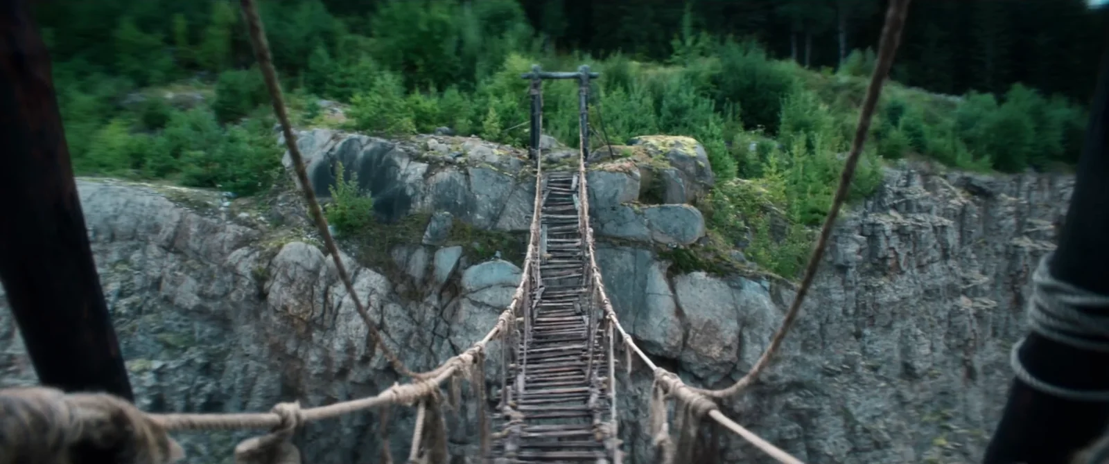
The ropes enter from the two foreground corners and pull the eye toward the narrow wooden passage, while the space around the bridge exposes a void that cannot tolerate a wrong step. The composition needs no terrified face to create tension; its geometrical relationships are enough: two solid rocky sides joined by a fragile line that seems barely able to carry anyone across. Cool green gradations make the opposite end feel farther away rather than closer. Once the shot is stripped of a crowd, distance itself becomes a visual adversary, and crossing a few meters becomes a matter of weight, balance, and possibility.
A Small Tenderness Between Two Walls
The image sets a standing adult body against a seated child, but the movement connecting them lacks the harshness their difference in height might suggest. The man’s hand reaches delicately toward the girl’s hat, while a brick wall occupies the left and dark masses press in from the right. The opening of light at the passage’s end offers a distant exit rather than immediate release. The composition combines the child’s vulnerability with the adult’s capacity for care, making the small gesture more prominent than the surroundings. This image makes the meaning of possible loss tangible in the distance between a hand and a hat.
A Gleam That Cannot Carry Itself
There are no faces or weapons in the image, only two gold bars on a rough wooden surface. A patch of warm light catches their upper edges and reveals scratches in the metal, while everything beyond them dissolves into brown darkness. This visual isolation creates a clear irony: the most attractive things in the story cannot move by themselves. Rough wood and heavy shadow remove the gold from the familiar image of luxury, making it a solid object that needs hands to lift it and pay its price. The material details are more persuasive than any direct metaphor for greed; value begins with the object’s texture and weight.
Bodies Diminished Beneath Green Columns
Tree trunks rise like repeated columns beyond the image’s limits, with cool light filtering through their crowns. At ground level, a small white cloud and bodies barely distinguishable from the background appear, and human signs are lost within the network of vertical lines. The viewer’s eye first climbs the trees, then returns to search for the source of movement at their base. Through this difference in scale, nature asserts its presence even in a moment of disturbance: the effect of movement looks slight beside the surrounding wooden mass. Repetition gives the frame visual order, but the trees’ density makes the forest a space in which everything happening cannot be controlled.
Authority at the Tent’s Edge
We look from inside a dark tent toward a lit work yard, so the fabric edge becomes a frame pressing on bodies exposed to the sun. In the depth, a man stands upright with his hands near his waist, while those seated at tables are occupied with different activities. People occupy different levels of proximity and clarity, and the image does not look like a meeting of equals: some can stand and watch, while the space obliges others to remain within the work system. The dividing line between foreground shadow and background light links authority to the body’s position in space rather than to any dialogue that might occur there.
A Face the Size of a Slit in Glass
The man’s eyes appear within a small rectangular opening, bordered by a broad black strip above and a pale surface below. Almost all his other features disappear, yet the frame preserves contact with his gaze. Placing the face in this opening turns looking into a restricted act of surveillance: we see very little of the person, and he too lacks an open field of vision. The effect depends on a strict economy of visual information rather than an extreme expression. Concealment here is no ornament; it makes caution part of the image’s form before it becomes a meaning attributed to the character.
One Table, Faces That Do Not Agree
The table places the men at separated edges but lets hands and glances exchange movement across the image’s center. In front are a smiling face and a raised hand; in the middle, a man leans his cup toward the others, while the reactions of seated and background faces differ. Metal utensils, rolled sleeves, and similar clothes create a shared language of labor without erasing differences between participants. The frame captures the possibility of temporary warmth within a mixed group: gathering around food suggests practical closeness, while the multiple lines of sight prevent us from treating it as complete or guaranteed agreement.
The Body Against an Unyielding Surface
Rock occupies most of the frame with its roughness and winding cracks, while a man leans forward to strike it with a long tool and another arm holding a work tool enters from the edge. The composition leaves little room for faces, as though the true measure here is the relationship between muscles and solid material. The slanting arm’s movement confronts the wall’s stillness, and the broken lines of the stone answer the tool’s sharp line. This opposition turns the hardship of labor into a specific visible form rather than information the story gives us about harsh conditions.
A Smile That Cannot Remove the Bars
The girl stands at the center of the frame and faces us with an open smile, while vertical bars cut through the space between her face and the viewer’s eye. Soft yellow light gives her skin and clothes a warmth suggesting closeness, but the dark depth behind her limits that feeling. The contrast is not simply an abstract opposition between innocent childhood and a harsh world; it lies in conflicting physical details within the image itself: a lit face and a black obstacle, a direct gaze and an imposed distance. The shot gives separation a quiet but cruel form because the smile cannot remove the barrier we see.
A Smile Confined to the Front Seat
The foreground face fills most of the image with a tired smile and clear marks of injury near the eye and temple, while two men in the back seat recede into a darker, softer space. The smile does not seem separate from its surroundings: violence remains legible on the skin, and the bodies behind it stay close together inside a cramped cabin. The difference in focus privileges the man’s face for this moment without isolating him from his companions. The frame preserves a fine contradiction between the open mouth and the harsh features, as though relief cannot erase what the body has endured.
Scattered Eyes Within Shared Cover
The characters gather behind a raised green mass, but almost every face looks toward a different point outside the image. The nearest man holds a weapon forward, another crouching lower watches what is beside him, and the remaining bodies appear at different heights. Dense forest conceals what the group is watching, so we notice instead how attention is distributed among its members. The composition creates collective suspense without turning the group into a single mass: agreement to take cover does not mean everyone assesses danger in the same way, and that distance between glances remains visible within a shared moment.
Power Belongs to Whoever Owns the Desk
A seated man occupies the center of a broad wooden desk, while another man’s out-of-focus back appears in the foreground. Papers and tools are spread before the seated figure, with a bird of prey on a stand beside his right shoulder; behind him, wooden walls and working hours establish a closed administrative character. The scene needs no direct punishment to establish unequal power: one side occupies the space’s center and receives visitors, while the other is reduced to a shoulder and an opposing gaze. The distance across the desktop becomes part of the mechanism of control, and the bird adds a silent element of threat to the arrangement.
One Step Fills the Image
The camera drops to the level of a boot on a worn wooden plank, while ropes, socks, and other feet appear behind it. The larger details of the crossing almost disappear in favor of a very small test: where does a person put their weight on the next step? Wood fibers, dampness, and irregular lines in the passage’s surface become prominent, making the material look breakable before anything happens. After the bridge’s wide shot, this approach gives danger a different scale; we no longer see the whole distance, only a single point of contact on which the body’s fate may depend.
The Map Does Not Unite the Glances
A man in the foreground holds a pale sheet folded in his hands, while men’s faces, shoulders, and weapons spread behind him among dark trunks. The paper stands out at the scene’s center as the only thing that seems readable or open to agreement, yet the surrounding glances do not converge. Some watch ahead, some look beside the path, and another remains behind. This density gives the group a tense presence: a plan can gather people around a common goal, but their different positions in the frame preserve all the doubts the paper cannot resolve.
A Distance Between the Face and the World
The woman’s face occupies the left side in a quiet profile, with parallel trunks and softly focused forest receding behind it. She does not face the camera but looks toward an area outside the image, while indistinct human forms and vehicles appear in the depth. This arrangement lets us read a moment of listening or assessment without imposing a single feeling on it. Visual isolation does not entirely separate the woman from the group; it brings her closer to us while keeping the world she moves through present at a distance. That distance is what gives her gaze its weight.
A Tree Through the Middle of Power
A straight tree stands almost at the composition’s center, separating a nearby man seen from behind from another facing him across the space. The distant man holds a long gun pointed at the ground, while a flag behind the first creates another vertical line. The arrangement needs no overtly threatening movement: the distance between the bodies, the visible weapon, and the natural boundary of the tree divide the field into two clear areas. Restrained greens and daylight refuse melodramatic exaggeration, leaving the spatial relationships themselves to carry the weight. Any dialogue cannot erase these boundaries drawn within the image.
Flame Illuminates What Goes Unsaid
Orange light burns at the frame’s edge, catching one side of the seated man’s face and leaving the other in dense shadow. His eyes turn slightly downward, and his shoulders settle into a posture that does not suggest a display of strength. The image does not show the broad exterior space that fills the journey’s shots; it reduces the world to a face and the short distance separating it from the fire. This visual contraction gives exhaustion room to emerge without a visible wound or a shout. The anticipated movement of flame remains perceptible in the contrast between light and dark areas, while the man’s features stay comparatively still.
A Passage Swallowed by Nature
Green-covered rocks close off both sides of the frame, and a fallen trunk cuts across the route from the upper left toward a deeper area. A small human figure appears within this tangle, its size almost merging with the grass and rocks. Unlike an open forest view, the image offers no restful horizon: every possible route seems confined between two obstacles. Green is more than a sign of life; it becomes dense material occupying the very space of movement. The viewer consequently reads the place as a series of difficult bodily decisions: passage requires twisting, descending, and attention rather than straight progress alone.
A Face That Cannot Conceal Tension
The camera approaches the woman’s face until her eyes, lips, and moist skin texture become the main elements of the reading. Rough tree bark rests behind her head, and an indistinct foreground mass further constricts the available space around her face. Her chin rises slightly, but her lips remain closed and her gaze fixes near the lens. These details cannot establish what she is thinking, but they make tension tangible in the small effort she makes to keep her features composed. It is a restrained performance that the image measures in centimeters rather than broad movement.
The Wound at the Center of the Power Balance
The injured face occupies the center of the foreground, bruises and blood clearly marking the eye and cheek, while two men stand behind it and dominate the upper space, with a weapon at the composition’s edge. The seated man is lower than those around him, and the difference in height reveals the imbalance without requiring the whole event to be explained. Warm interior lighting does not soften the image; it makes the scratches visible and the surrounding eyes more obscure. The body becomes a record of what has happened to it, while the presence of observers gives every sign of pain a dimension beyond an individual injury.
When the Weapon Reduces the Scene
The arm extends toward the camera, and the pistol’s muzzle becomes an explicit axis for the gaze, while another man in a broad hat stands behind the gunman. The forest recedes into a blurred green background, leaving nothing to compete with the weapon for attention. This clarity gives the moment immediate force but also reveals the limits of the more conventional confrontation composition: conflict narrows to a single direction, and multiple faces and complex distances lose some of their effect. The shot therefore succeeds more in announcing danger than in expanding our understanding of the relationships around it.
When Boundaries Dissolve into Blue
A cold blue layer crosses the image and dissolves detail, while a dark human form and tangled branches appear toward an area lit from above. The exact distance between the objects and the surface through which we see them is hard to determine, turning vision itself into an experience of uncertainty. Danger is no longer tied to a weapon or an opponent whose direction can be identified, but to a visual medium that prevents the eye from fixing the place. This scene differs from the wilderness greens and the fire’s warmth: the flat blue reduces the color range and intensifies separation. The environment imposes a confusion on the viewer close to that of the body within it.
The Body Cries Out Before It Rises
A man leans forcefully over wet rocks, one hand planted on the surface, while another body bends lower before him. The open mouth, extended arm, and horizontal line of water charge the image with immediate exertion. The handle of a sharp tool embedded in wood at the scene’s edge remains a fixed detail against moving bodies. The frame does not present danger from a comfortable distance; it makes us see muscles bracing against the ground to prevent a fall or recover balance. The moment’s humanity forms through bodies needing support rather than through complete individual heroism.
The Road That Swallows Footsteps
The dirt road stretches from the bottom of the image toward a distant bend surrounded by trees, with a small man moving along it and an old car standing to the left in the depth. Faces and the details of immediate exertion no longer appear; what remains is the difference between the body’s scale and the length of the distance still ahead. Cool sky light opens a broad field but gives the road no clear end. This image suits the study’s closing because it returns burden to its simplest form rather than summarizing the story’s ending: a person moving within a space larger than their capacity to control it.
NOT THE END OF THE STORY
Between the narrow bridge and the open road, between gleaming gold and the exhausted face, The Weight’s images reveal that heaviness is measured by more than metal: it is also the space the body needs to keep moving.