VISUAL STUDIES / FILMS
Verity
Faces that read, a house that watches
Words cross the reader’s face, clothes await another body, and the desk stays ordered when its occupant is absent. Through these images from Verity, we follow how knowledge is divided between those who look and those who appear before them, and how windows, mirrors and paper become ways of approaching a life whose proximity never grants us complete certainty.
A face may occupy most of the image while its eyes disappear behind sunglasses. A distant person may remain clearer than two embracing bodies in front of us. Distance alone does not determine how much we know.
Five designs for a face hard to contain
Nested cuts, a gaze above a red house, faces towering over architecture, separate bodies, and snow replacing shoulders.
Faces nested in the cuts of a single image
The composition begins with Verity’s large face, then opens triangular spaces within it for smaller images of Lowen and Jeremy. The cutting edges continue from the features into the red fabric, making one person’s fragmented image the means through which others become visible. Each face retains a measure of clarity, but their combination does not produce a body we can treat as a natural whole. Near the base, the white title crosses these layers in supple lettering that counters the severity of the cuts. The design’s strength lies in how it orders our access to people: one face commands the view, another appears within its boundaries, and a third emerges through a narrower opening. Their relationship becomes a matter of visual containment, with unequal scales and unequal rights to occupy space.
Two large eyes above a red house
The eyes occupy the top of the poster, with the triangular window peaks below forming a sharp extension of the face. Red floods the scene behind the glass, while two small figures draw close at the base and a glossy surface returns part of their silhouettes. The difference in scale brings a small bodily encounter beneath a gaze far larger than the space it occupies. The figures do not share the realism of a single location, but the design places their meeting under the authority of a face that rises above it and surrounds it through color. The white title sits over the window without concealing the embrace, leading the eye between the name and the bodies before returning it to the gaze above. The house becomes a medium through which privacy is exposed and can be observed from outside.
A small house beneath enormous faces
The three faces gather in the upper half, while the illuminated house settles among the trees beneath the title, much smaller than the features filling the sky above. This difference gives the characters authority over the setting before we know its details, while the yellow windows offer warm enticement within a dense expanse of blue. Verity’s face advances in the center; the faces to either side reveal only portions of themselves, keeping the hierarchy of attention clear despite their visual assembly. The title curves across the area connecting people and architecture, making the house a shared base beneath images competing for prominence. The design suggests the reach of the characters’ influence over a domestic space that, from a distance, appears limited and containable.
Three bodies turn their gaze backward
The three bodies remain separate against a sparsely detailed gray background, allowing posture and the direction of each face to be read before we look for a story within the setting. Verity occupies the center at a larger scale, turning her face toward the viewer while her body maintains a sideways orientation. The turn recurs in different degrees at either edge, creating a gestural connection without bringing the figures into a direct encounter. Black unifies their clothing, then pale spaces separate the boundaries of one person from the next. The red title adds weight near the central body, reinforcing the priority of that position. The poster depends on the difference between proximity within an image and the independence of bodies: their assembly remains an arrangement for looking rather than a sign of a reassuring relationship.
A snowy landscape replaces the shoulders
Verity’s face meets the viewing position directly, then snowy ground and a house facade replace the area where we expect her shoulders to continue. The composite links features and setting through one pale surface, while keeping the side faces enclosed in denser darkness. Red picks out the lips and the title at the base, making a line of attention that crosses from expression to name against the white. The house appears distant and almost entirely visible, while the advancing face is large enough to abolish our distance from it. The design thus combines two different kinds of clarity: a small location presented from outside and a nearby person occupying most of the image. Their relationship rests on boundaries passing from the body to the landscape that contains its story.
The posters are read as designs distinct from the film’s frames, preserving each design’s original composition.
Who controls the viewing position?
Twenty-four readings of words, clothes, hands, faces and the edges of the house.
The sequence moves between public appearance and private space, between details of touch and the breadth of a setting. Each frame makes its own argument and can be opened in full with its title and reading. The study includes visual references to events in the film.
Branches conceal the house before arrival
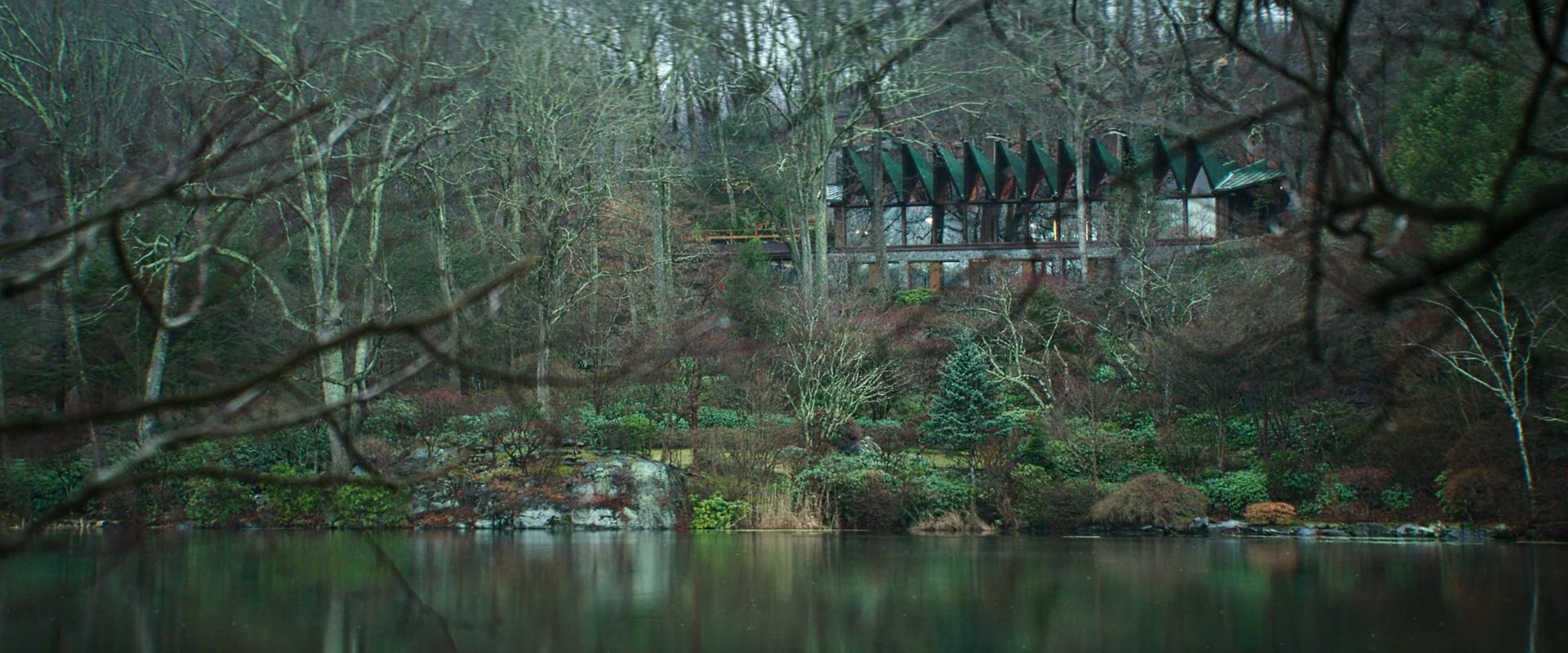
Water separates the viewing position from the house, and nearby branches cross most of the image before we reach its facade. The roof peaks repeat in a clear geometric line, interrupted by trunks and limbs that do not follow its order. This contrast makes the building recognizable while keeping visual access to it fragmented. The water also holds faint reflections of color instead of offering a clear copy of the place. The scene’s reserve arises from the many layers preceding the home: a branch, a bank, water, and further trees. The house is present and its location can be identified, but distance and obstruction make it an object of observation more than a space we can freely enter.
A microphone reaches a restrained mouth
The microphone stem extends from the right of the image to Lowen’s mouth, giving speech a visible path even while her lips remain closed. She raises her eyes slightly, and the difference in direction between eyes and mouth divides her presence between following someone before her and preparing to respond. The warm background separates her features from the brickwork, while the indistinct edge of a book enters the lower foreground. Two means of presenting a writer to an audience sit together: the page and amplified sound. Yet the face retains a reserve that these devices do not dissolve. The shot lets us see the difference between being given space to speak and being able to occupy it confidently, in a close composition that does not show the audience itself.
A raised glass and a sideways gaze
Verity raises the glass beside her head while her other arm extends across the desk and her gaze turns away from the screen occupying the foreground. Light reaches her face, hand and pale fabric, leaving the device a black mass that blocks what should be the site of her work. The glass and arm recur in reflections on the glossy surface, giving bodily posture a stronger visual presence than the absent content of the writing. The lamp behind her head also increases the sense of being settled within a private space. The writer appears here through her way of occupying the room and distributing her attention: gesture and gaze take precedence over any words that may be displayed before her.
Large words cross their reader’s face
Enlarged lines cross Lowen’s face and continue beyond its boundaries to both sides of the image, bringing page and reader together on a single composite surface. A pale column cuts through the foreground near the eye, while the fingers rest at the mouth and leave the gaze exposed. The letters’ sharpness differs from the softness of her features, dividing attention between trying to read and following the body’s response. This is a visual expression of text and reaction overlapping; we can examine it without treating the words as independent evidence that their account is true. Writing occupies more space than the person whose face we see, subjecting her private emotion to the pressure of a language spreading over her and asking her to read the world through it.
A hand arranges the story at floor level
Writing descends to rug level, where colored cards form incomplete rows around the seated Lowen. One hand picks up a card while the other rests near a different one, turning the arrangement of ideas into bodily movement we can follow. We do not need to decipher every word to see that the text can be taken apart and reassembled, and that a small decision by the fingers can change the distance between two sheets. Differences in color separate the units, while the fabric’s roughness gives mental work a tangible surface. The image condenses the writer’s authority into a modest-looking act: choosing what sits together, what comes first, and what remains outside the story’s final arrangement.
Many books and seats awaiting a reader
Books line the lower edge with their covers facing the seated people, while Lowen presents her back to the viewing position and her face to chairs occupied by only a few attendees. Shelves surround the scene on every side, making the supply of books seem far greater than the density of attention directed toward their author. Some people face her; others are occupied with reading or a sideways movement, so participation disperses rather than gathering into a single response. The composition leaves the writer amid a marketplace full of printed voices, with a scattered human presence before her. The empty chairs take their meaning from their position between author and shelves, revealing the gap between a work’s existence and finding someone to listen to it.
A white shirt between body and mirror
The mirror presents Lowen’s face clearly, while part of her body and hand appear out of focus in the right foreground. Behind her reflection, the man’s back occupies a large area of the same white that surrounds her arms, allowing clothing to connect two people whose faces do not meet within the image. Lowen raises her hands near her mouth and collar, making the shirt an object through which she adjusts to a new appearance. Pale walls emphasize the difference between the heads’ directions despite their closeness in color. The reflective surface does more than return a solitary person: it brings her presence together with the image of a nearby man, making proximity legible through material that can be worn and touched.
A dress seeks a body before the mirror
Lowen raises the red dress between her body and the mirror, placing the color on two facing surfaces divided by a narrow vertical edge. Holding it up lets her try an appearance before wearing it: she can compare her image with the fabric while retaining her dark clothes underneath. Other garments line up on hangers behind her, while hinges, wood and shelves add precise order to a space devoted to personal belongings. Removing one piece from that row therefore becomes a distinct act of selection within the setting. The frame links the desire to resemble someone with a specific practical step: a proposed image of the self begins with a borrowed color raised by the hand, then tested by the eye on a reflective surface.
A turn separates the face from the body’s direction
Verity’s arm extends toward the tabletop and her body continues in that direction, while her face turns back toward the viewing position. The difference creates movement within the pose itself and gives her turn priority over the less distinct surrounding bodies. Slender glasses and metal columns repeat in the background, countering the dress’s diagonal lines with illuminated vertical elements. Red also sustains her presence among the party’s warm tones without separating her chromatically from the whole setting. The visual appeal rests on how much attention the character can redirect: she remains part of the nearby gathering while opening another relationship through her face with someone beyond what we can see.
Fingers pause at a mark in the wood
The polished fingers approach a worn area on the wooden edge, and warm light brings two different textures into a confined space: smooth skin and a surface that has lost part of its regularity. The banister extends diagonally, giving the eye a path interrupted by the rough mark near the hand. Faces and the room’s wider architecture disappear, making touch the available means of knowledge within the frame. The shot does not establish the mark’s cause or age, but gives it weight through the pause beside it. The house’s familiarity becomes open to revision through a small detail a hand might pass over every day, until it suddenly becomes something demanding a closer look and a meaning yet to be determined.
An illuminated desk preserves an absent woman’s place
The lamps balance on either side of the desk, beneath a circular window showing cold blue within the warm room. The screen occupies part of the center, and red fabric appears on the chair behind it as a trace of color in the place a body should occupy. Glossy surfaces and writing tools extend through the foreground, leaving the conditions for work ready even though its author is absent. This order gives absence a clear, locatable volume among the objects instead of leaving it as a general emptiness. The room seems able to retain life’s arrangement after participation in it has stopped, and the visual question remains suspended over who will sit in the place prepared in advance.
A clear screen and a baby deep in the room
Verity and the computer occupy a clear foreground, while the man holds the baby within the distant doorway’s rectangle, where their features are less distinct. The image brings work and care onto a single path into depth, separating them through degrees of focus and the direction of attention. Her face stays directed toward the screen, while the man and baby share a connected mass of arms and bodies. This division reveals adjacent fields of attention, without being sufficient on its own to establish a moral position toward either. The frame makes the house a space in which tasks compete for their place in the image, setting the writer at the forefront of work that does not erase the presence of others behind her.
A refrigerator opens a patch of light inside the house
The refrigerator door opens an intensely blue rectangle within an expanse of warm wood, and Lowen stands with her back between the viewing position and its contents. The interior lights the edge of her hair and arm, while most of her body remains a dark mass concealing some of the food on display. Containers and fruit sit together under this clear light, preserving details of an ordinary domestic act despite the low visibility around it. Tension arises from the limited area the character can illuminate while searching within it: everything behind her shoulders remains outside the direction of her attention. The frame turns an everyday source of comfort into an unequal relationship between a small exposed space and a broad surrounding area its occupant is not looking toward.
Dark glasses against sharply visible snow
The black glasses separate the eyes from the viewing position, while the pale snow behind her head makes the edges of face and hair easy to distinguish. The wheelchair’s support approaches the side of her features, with metal parts extending to the edge, linking the body’s position to the device supporting it within the composition. This surrounding clarity and central concealment create a precise paradox: we can examine the person at close range, yet have no access to the path through which her eyes are looking. Closed lips and a tilted head carry a limited expression open to different readings. The image’s intensity depends on what a small piece of dark glass conceals amid a white area that leaves almost everything else exposed.
Tilted eyes search for a direction
The face tilts until the familiar relationship between the eyes and the image’s edges changes, while proximity cuts away most of what might explain the body’s position or location. Blue spreads over the skin, and the eyes retain tiny highlights that draw attention amid the surrounding softness. This framing makes reading direction a slow task: we search for something the features are looking toward and find that the entire context lies outside the frame. An open eye can provoke suspicion, but the frame offers a limited visual presence whose possible meaning extends beyond the information available within it. The effect comes from the viewer’s unsettled position before the face and the difficulty of converting extreme closeness into stable knowledge of its owner.
A small table before a cold expanse of glass
The three characters gather around a limited dining area, while windows extend behind them toward water and winter trees far larger than the space of the encounter. Lowen raises a utensil near her mouth, Jeremy holds a glass, and the child sits between them with his back to us, giving the gathering an intelligible everyday rhythm through small gestures. The cold outdoors counters the tones of wood and clothing inside, but the glass does not isolate the landscape from the participants: it remains present above their heads and in the empty spaces around them. The frame makes intimacy a local activity requiring people and reciprocal actions, within a broad setting that can contain them without becoming equally intimate throughout.
Reading outside beneath a concealed gaze
Lowen, the book and the wheelchair’s occupant appear outside the window, while an indistinct head enters from the left foreground and occupies a large part of the field of view. The wooden frame slopes diagonally below, emphasizing that the encounter reaches us from a particular interior position, through an opening that permits some of it to be seen while concealing the rest. Reading and care sit together outdoors, but the foreground arrangement adds the act of watching from a distance. The composition does not give us the watcher’s full face, making their attention clearer than their identity in this moment. The relationship is distributed among the person reading, the person receiving the reading, and the person watching them, each with a different amount of knowledge available about the others.
A yellow coat slows the breadth of the snow
The child’s yellow coat draws the eye to a small area on the right, while the man advances into the depth of a garden whose details are largely covered by snow. A low tree forms a broad mass on the opposite side, and the green cart and red boots preserve traces of daily use within the white. We see both people from behind, so their relationship appears through differences in size, distance and direction of movement more than through expression. The expanse of ground leaves clear room to advance, while the child remains close to the camera’s position. Color gives his body visual priority, making the act of following smaller steps part of how we read the large space and those preparing to cross it.
Repeated lamps divide the presence of passersby
Globe lamps repeat above the corridor and in its glass reflection, creating a regular rhythm crossed by bodies of different sizes and degrees of clarity. A dark figure occupies most of the right foreground, while Lowen walks in the distance through the bright space near the seated people. Transparent surfaces reveal multiple layers of the setting, then reflections make separating some from others more difficult. Everyone seems present within a broad structure open to view, yet the amount we know about each figure differs greatly. The shot shows how orderly architecture can distribute attention unequally: one person obstructs through their mass, while another becomes a small detail within the regularity of light and work.
Branches from another landscape cross a face
Lowen’s features, branches, water and the distant man’s figure meet in a transparent layered space, making the face’s boundaries seem connected to a horizon that does not share its scale. Branches pass over eyes and hair, and white crosses near mouth and neck, making it difficult to give inside and outside separate areas. The composite effect can be read as it appears within the frame without deciding whether it comes from a reflection or a transition between two images. What matters here is that face and landscape share the same surface while each retains a different scale. This combination gives thinking about the outside world a visible form, leaving the person present within a setting that exceeds her body’s boundaries without granting her complete clarity.
A close embrace beneath a distant presence
The embrace fills the left foreground with a warm mass of hair, shoulder and arm, while the distant woman stands within a blue rectangle opening onto depth. Differences in color and scale quickly separate the two areas, then the unity of the frame reunites them in a relationship of closeness and observation. The bodies’ contact conceals their faces from us, while the distant figure’s frontal orientation gives her a clearer presence despite her small size. The expected order of knowledge is reversed: we come close to touch without being able to read its participants, and move farther from a face while sensing its direction toward us. The image draws its pressure from an intimate connection continuing within a visual field containing a third person, present in a place the embracing pair cannot see before them.
A doorway clarifies the distant and conceals the near
The man within the illuminated doorway receives a face, hand and body we can follow, while Lowen approaches the foreground as a dark mass with incomplete features. This difference directs attention toward the more distant person, leaving the nearer one present through what she blocks from view. His hand rests near his mouth in a pose that makes hesitation part of the image, and the uprights confine him within a rectangle filled by the wall pattern behind. The relationship of watching is established through the orientation of two bodies that are unequally exposed. The viewer sees the man from a position close to where Lowen stands, but remains outside what the looks exchange or what may have caused each person to stop on their side of the doorway.
Two gazes receive a color arriving in the house
Lowen stands in red within a wooden opening, while the man and child appear from the right foreground as two backs and two gazes directed toward her. Color catches the center of attention, and the dark garments near her hand gather the rest of her appearance into a mass stopping at waist level. Her head rises toward something beyond the upper edge, giving her a different direction from the two looks receiving her appearance. The composition lets us see her as two people inside the house do, while keeping their facial responses out of reach. Color’s entry into the setting becomes a social act requiring someone to notice it: the new appearance is not completed simply by putting on the dress, but enters the expectations of people sharing the same space.
An illuminated chair behind layers of darkness
Verity occupies a partially illuminated area on the right, while dark edges cut through the foreground and divide the room into openings of differing widths. Pale fabric extends the body down the chair, with the hands held close above it, creating a clear center within the surrounding blues. A distant lamp on the left forms a separate warm area without bringing the two sides together into one comfortable space. These layers place us outside the seated position and allow the character to be examined from a distance that does not let us share her presence. The frame closes the house’s relationship with observation through a simple, decisive difference: a body remains visible inside, and a gaze reaches it from a dark side that does not reveal its owner.
Proximity that leaves something concealed
The mirror retains a copy, the paper an account, and the clothes an appearance that can be borrowed. The house redistributes these images between those who appear and those who watch, while the step from seeing to judging remains larger than the distance a gaze travels.