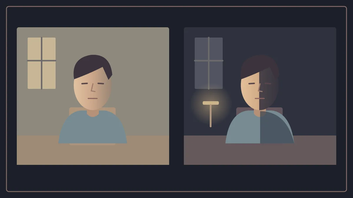
Put a person on a chair in a room.
Keep them in the same position.
Do not move the camera.
Do not add another actor.
Now light their face with soft light from a large window, leaving the background relatively clear.
You have one image.
Close the window and let a small, hard source strike half their face while the other half disappears into shadow.
You have another image.
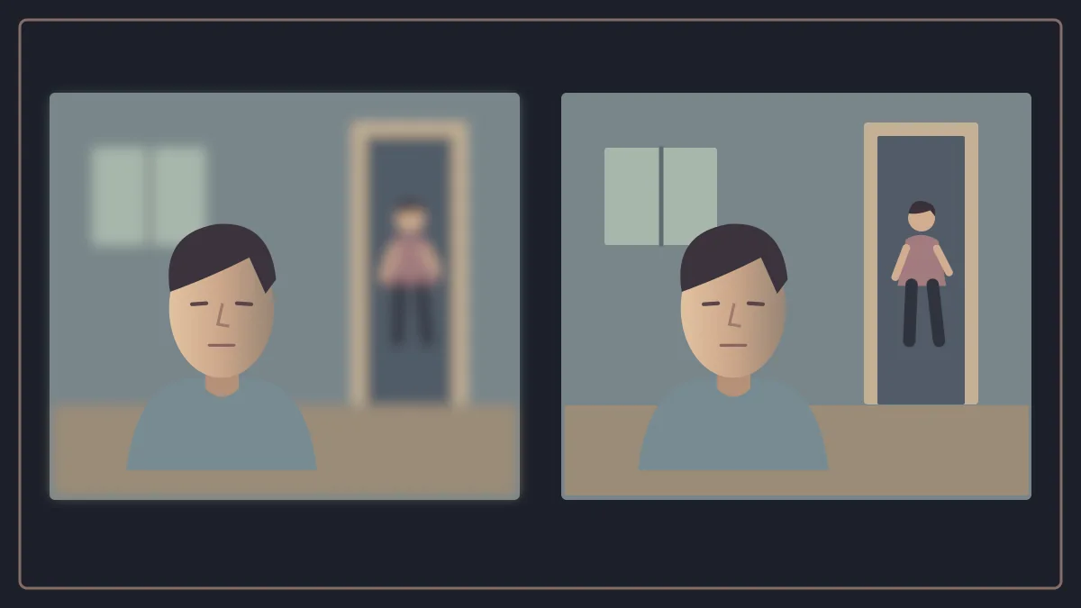
Then change the lens and move the camera closer or further away until our sense of distance and the surrounding space changes.
The third image needs no different line of dialogue to seem as though it belongs to another scene.
Here, we reach an essential stage in the language of cinema:
What matters is more than what is in front of the camera.
Or simply where we placed it within the frame.
It is also:
How did we choose to see it?
Light Does More Than Let Us See
Light’s simplest function seems obvious: without it, the camera cannot record a useful image.
But reducing lighting to making things visible is like reducing music to letting us hear sounds.
Lighting chooses.
What do we see first?
Which part of the face remains clear?
What disappears into the background?
Can the eye read the whole space easily, or must it search within it?
Is the face clearly separated from the wall, or does it almost dissolve into it?
These are storytelling questions as much as technical ones.
Changing the lighting therefore means more than changing the image’s “brightness”.
It changes the relationship between things within it.
Something present since the beginning of a scene may suddenly become important simply because the light reaches it.
A character may be fully in front of us, yet shadow makes part of them unknown.
Key, Fill and Backlight: Tools, Not a Sacred Recipe
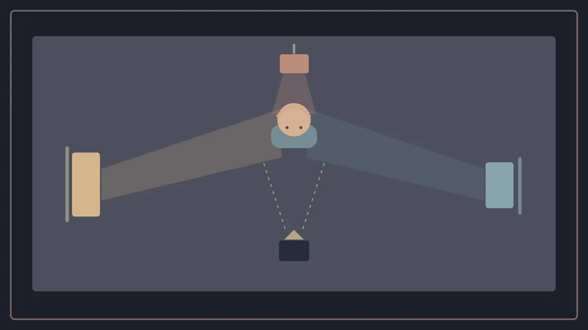
One of the best known simplified ways to explain cinematic lighting is three point lighting.
There is usually a key light, the principal source shaping the subject.
A fill light helps control the shadows and contrast left by the key.
Backlight, or lighting from behind, can help separate the character’s edges from the background or give them a different visual presence.
But we should pause here.
This is not an equation saying that every scene needs three lamps in memorised positions.
Key, fill and backlight are a simplified introduction to understanding, not a compulsory recipe. It is also wrong to describe backlight as light that “removes shadows around the character”; depending on the design, it may separate edges or create a rim, rather than perform one fixed function in every shot.
A scene may be lit with one source.
Or it may look as though it has one source despite extensive equipment outside the frame.
Another scene may benefit from a complex network of sources.
The more important question is not:
How many lights did we use?
But:
What does the result do within the image?
High Key and Low Key Mean More Than “Light” and “Dark”
Two terms recur in discussions of lighting:
High key lighting and low key lighting.
The useful distinction concerns the degree of contrast and the distribution of light and shadow within the image.
In high key lighting, differences between bright and dark areas are usually smaller, so shadows appear lighter and the distribution of light more even.
Low key lighting generally relies on greater contrast, with more prominent areas of shadow and parts of the image that are not given the same degree of clarity.
Even here, however, we should avoid turning the terms into rigid psychological symbols.
High key does not mean “happiness”.
Low key does not mean “evil”.
Bright, even lighting can be used in a disturbing situation, with the tension arising from the contrast between form and content.
An image with low illumination and high contrast can also be calm, romantic or contemplative.
High key is therefore not simply “a strong key plus an even stronger fill”. It is more accurate to think about the visual result, contrast ratio and distribution of lighting, rather than turn an approach into a fixed recipe for lamp intensity.
Hard and Soft Light: The Difference Is in the Shadow’s Edge
There is another distinction we see more often than we name.
Hard light produces shadows with relatively distinct edges, giving texture and contrast greater presence.
Soft light has more gradual transitions and less sharply defined shadow edges.
But “hard” does not mean stronger.
And “soft” does not mean weaker.
We are discussing the character of the light, how it wraps around the subject and how it transitions between illumination and shadow.
Soft light can be very bright.
Hard light can be dim.
This distinction matters because everyday words can mislead us.
In cinematic terms, we are not describing how we feel about the lamp.
We are describing its effect on the image.
Why Does the Light Seem to Belong to the Place?
Imagine someone sitting in a room at night.
There is a lamp on the table.
If the light on their face appears visually connected to that lamp, the lighting source becomes understandable within the logic of the world.
This brings us to motivated lighting.
The idea does not necessarily mean that the lamp visible on camera is the only thing actually lighting the actor.
There may be a whole set of cinematic equipment outside the frame.
What matters is that the light’s direction and character appear logical in relation to elements within the scene.
A window.
A candle.
A desk lamp.
A shop sign.
A television screen.
A car’s light.
These elements can give the lighting a reason within the world.
When viewers believe the source, the image maker can build a more complex design around it than appears on screen.
When Darkness Becomes a Sculpting Material
One concept related to light and shadow is chiaroscuro, drawn from visual art traditions that use pronounced contrasts between light and darkness to shape volume and direct attention.
In cinema, its power does not lie in darkening half a face simply because the image looks “cinematic”.
What matters is what the contrast does.
It may make the background disappear so that only the face remains.
It may conceal part of a space.
It may make the distance between a light source and the rest of the world a tangible part of the scene.
Shadow here is more than an absence of light.
Shadow is information too.
When a film prevents us from seeing something, that decision can matter as much as what it lets us see.
Colour Does Not Begin in the Grading Suite
When we say “the film’s colour”, we may immediately think of colour correction or grading.
But the colour palette begins much earlier.
The wall colour.
The curtains.
The clothes.
The skin.
The car.
The furniture.
The light sources themselves.
All these choices enter the frame before the final image processing begins.
Colour therefore does not work separately from the mise en scène discussed in part three.
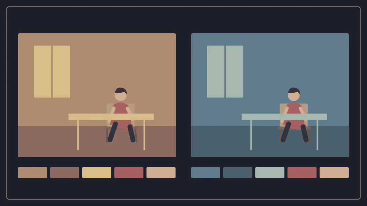
A character may wear almost the same colour that dominates the space, seeming to belong to it.
Or they may carry a clearly different colour and become a visual focal point even when small within the frame.
Warm and Cool Are Not a Ready Made Dictionary of Feelings
We often talk about warm colours such as red, orange and yellow, and cool colours such as blue and its shades.
The mistake begins when we say:
Blue = sadness.
Red = danger.
Yellow = happiness.
As simple as that.
Colour gains meaning from context.
Red may mean love in one scene, a warning in another, and an ordinary part of the decor in a third.
Blue may feel calm and comforting rather than sad.
The director, cinematographer, production designer and costume designer do not need a fixed dictionary.
They need a consistent system within the film itself.
If a work gradually gives a colour meaning through repetition, the history built by that film becomes more important than any general rule.
Saturation and Contrast Change Colour’s Presence
The question is more than simply choosing red or blue.
There is also saturation: how intense and concentrated, or subdued and restrained, a colour appears.
There is contrast between colours.
How close they are to one another.
And how many different colours the frame allows in the first place.
A highly saturated image can be playful.
But it can also become suffocating if the entire world is shouting visually.
An image with a restricted palette may feel realistic or highly artificial depending on how it is constructed.
Once again:
The tool does not have one feeling.
Context gives it that feeling.
A Lens Does More Than “Bring the World Closer”
We now reach one of the most influential decisions in an image: the choice of lens.
Discussions of lenses introduce the term focal length, usually measured in millimetres.
Put simply, focal length is related to the angle of view provided by a lens.
Wider lenses can show more of a scene from the same position.
Longer lenses provide a narrower field of view.
But this is more than a question of “how much can I fit inside the frame?”
Choosing a lens often changes where we need to place the camera to keep the character the same size.
This is where the sense of distance and perspective begins to change.
It is important to distinguish the concepts: focal length is a lens property that affects angle of view, while perspective also depends, fundamentally, on camera position.
A Wide Lens Does Not Automatically Mean “Power”
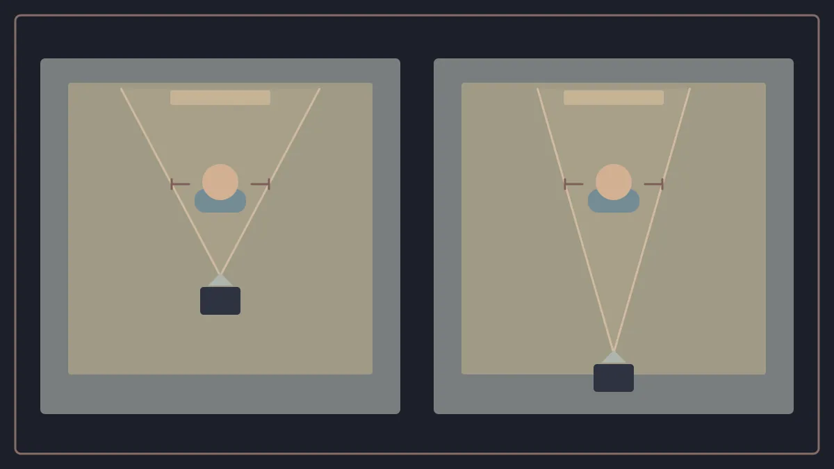
Suppose we want a close view of an actor’s face.
With a wide lens, we may need to move the camera very close to achieve the desired size.
This proximity can make distances between the front and back of the face, and between the character and the space, more apparent.
With a longer lens and similar framing, we will usually move the camera further away.
The apparent spatial relationship between planes then changes.
But we should not turn this into a ready made dramatic rule such as:
Wide = power.
Telephoto = weakness.
This reduction ignores the fact that a lens’s psychological effect depends on distance, composition, movement and context, rather than the focal length number alone.
A lens carries no moral meaning.
It changes how we see space.
The film then uses that way of seeing within its context.
Depth of Field Is Not Focal Length
It is important to distinguish two concepts that are often confused: depth of field and focal length.
Depth of field is the range of distances within a scene that appears acceptably sharp.
If the character is clear while the background becomes blurred shapes, we are dealing with relatively shallow depth of field.
When foreground, middle ground and background elements remain largely clear, depth of field is deeper.
Focal length is one of several factors affecting depth of field, alongside aperture, camera to subject distance and sensor size under the shooting and framing conditions used.
We therefore do not say:
“A long lens is shallow depth of field.”
Or:
“A wide lens is deep depth of field.”
The relationship is more complex than that.
Why Would We Want a Blurred Background?
Because sharpness directs attention.
When one face is clear against a very soft background, the separation between character and surroundings becomes strong.
But that does not mean shallow depth of field is “better”.
Sometimes, we need the opposite.
Imagine someone in the foreground while something important happens behind them.
If we remove the background entirely from sharp focus, we may remove part of the story.
Deep depth of field can allow more than one level of information to coexist at the same moment.
Viewers can choose where to look within a clear space.
Here, we return to the series’ central idea:
Every visual choice should ask:
What does the scene need?
Not:
What looks more beautiful in isolation from the scene?
The Same Scene in Three Different Images
Let us bring these tools together.
We have a simple scene:
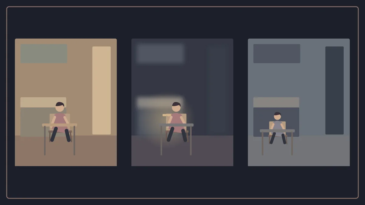
A woman sits in a kitchen, waiting for someone who is late returning home.
The screenplay does not change.
In the first version, we use relatively soft light distributed around the space, warm colours and a lens that allows us to read much of the kitchen.
The image may suggest waiting and calm.
In the second version, most of the space stays in shadow, with light coming from a single motivated source near her, and shallow depth of field isolates her from the rest of the room.
The waiting has become lonelier.
In the third version, the lens and camera position reveal a large empty space between her and the door, while we lower saturation and increase the contrast between light and shadow.
The same event.
The same character.
But the way we see the event has rewritten how it feels.
This is why treating the screenplay as the film is risky.
The text tells us that a woman is waiting.
The image decides:
How do we feel about that waiting?
Film and Digital: Not a Contest That Needs a Winner
Part one showed how the industry gradually moved from relying almost entirely on film stock to a world in which digital cinematography occupies a substantial place.
But when we discuss how images look, a familiar debate appears:
Film or digital?
The useful answer is not to declare a winner.
Film stock and digital systems differ in how they record light, texture, the nature of grain or noise, colour response, workflow, practical capabilities and cost.
A filmmaker may choose either for aesthetic or production reasons, or both.
But the medium alone does not create the image.
An expensive camera does not know where to place the light.
A strip of film does not choose the lens.
A digital sensor does not understand the character.
We should therefore discuss film and digital when the difference serves the look or the workflow, rather than as an absolute contest of superiority.
The Image Feels Nothing… but the Decisions Make Us Feel
This is the idea that brings light, colour and lens together.
No light is inherently “sad”.
No colour is always “frightening”.
No lens is “heroic”.
No depth of field is more “cinematic” than another.
There are decisions.
Each decision changes our relationship to what we see.
Light determines what appears and how it appears.
Colour connects things or separates them.
Lens and camera position determine our sense of distance and space.
Depth of field determines how much information remains clear to the eye at the same moment.
But a new question appears here.
If we have all these options…
Who decides how they work together?
Who says that a film needs this kind of light?
Who tests the lenses?
Who turns an idea such as:
“I want the character to look lonely despite being in a room full of people”
Into a camera distance, lens, lighting level, composition and movement that can be achieved on set?
Here, the series reaches its final step.
We are no longer studying tools separately.
It is time to see how a vision becomes an actual production process.
To Be Continued — The Sixth and Final Part
From the Director’s Vision to the Final Image: What Does a Cinematographer Actually Do?
About this series
This series begins with the origins of moving pictures, then explores framing, light, lenses, composition, and the choices that give an image meaning.
All parts of this series are now published.
All Cinema Journal articles