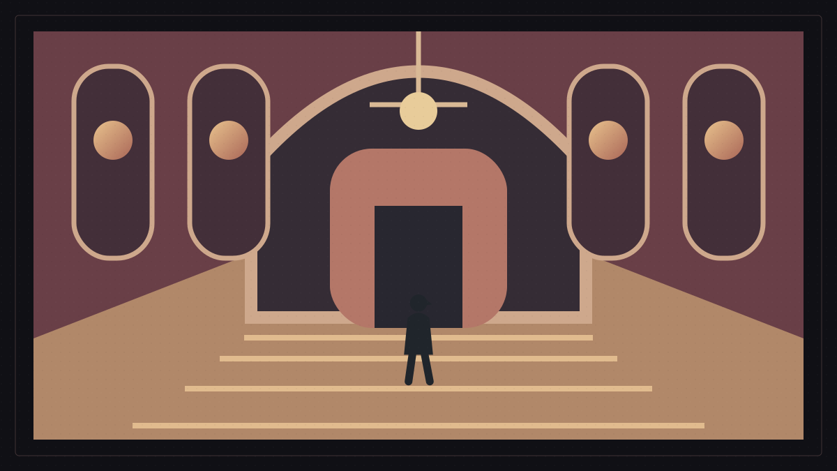
Put a person alone in the middle of an empty room. Now move them slightly toward the edge of the image and leave a large area of empty space in front of their face. Then return them to the centre and let the walls and surrounding lines converge on them.
The actor has not changed. Neither has the room, and no line of dialogue has been written. But the image has changed. In one arrangement the person might seem in command or trapped, depending on their surroundings; in another the empty space may seem more important than the person, as if something waits beyond the frame.
In the last arrangement the place itself can appear to lead our eyes toward the character. The cinematic frame stops being a rectangle that merely contains things and becomes a way of organising meaning. The question is no longer only what stands before the camera, but where we put it within the image.
Composition is not decoration. It is how a filmmaker decides what we see first and how we may feel about what we see.
Before composition, what enters the frame?
Before arranging the image, there is a tougher choice: what will enter it at all? Framing concerns the edges of the shot: what is included, what stays outside and the position from which we see it. Composition arranges the elements, their relationships and their visual weight within those chosen limits.
A whole room may stand before the camera, but the framing admits only the door, half a wall and a person near the edge. Composition then asks where the image feels heavy, where the eye will go first and whether one side seems more crowded than the other.
This distinction matters because a frame is never a neutral window onto the world. It is a choice. What lies beyond its boundaries can matter as much as what appears inside them.
The filmmaker's work begins with both decisions: determining the visible world and then arranging that world for the scene.
The eye does not read the whole image at once
When we watch a shot, we do not give every inch equal attention at once. Something makes its presence felt first: a clearly placed character, an unexpected area of empty space, a line that draws the eye or a group of objects arranged to create a path through the image.
That is the heart of composition. The aim is not simply to make an image pretty. It is to make it readable in the way the scene requires. Sometimes we should find the character immediately; sometimes discovery should take another fraction of a second.
The arrangement might make us feel balance or deliberately leave something unsettled, even before we can name the reason. These effects belong to the dramatic purpose of the shot.
Good composition is therefore not a single recipe. It is an arrangement that does a job.
The rule of thirds is a grid, not a judge
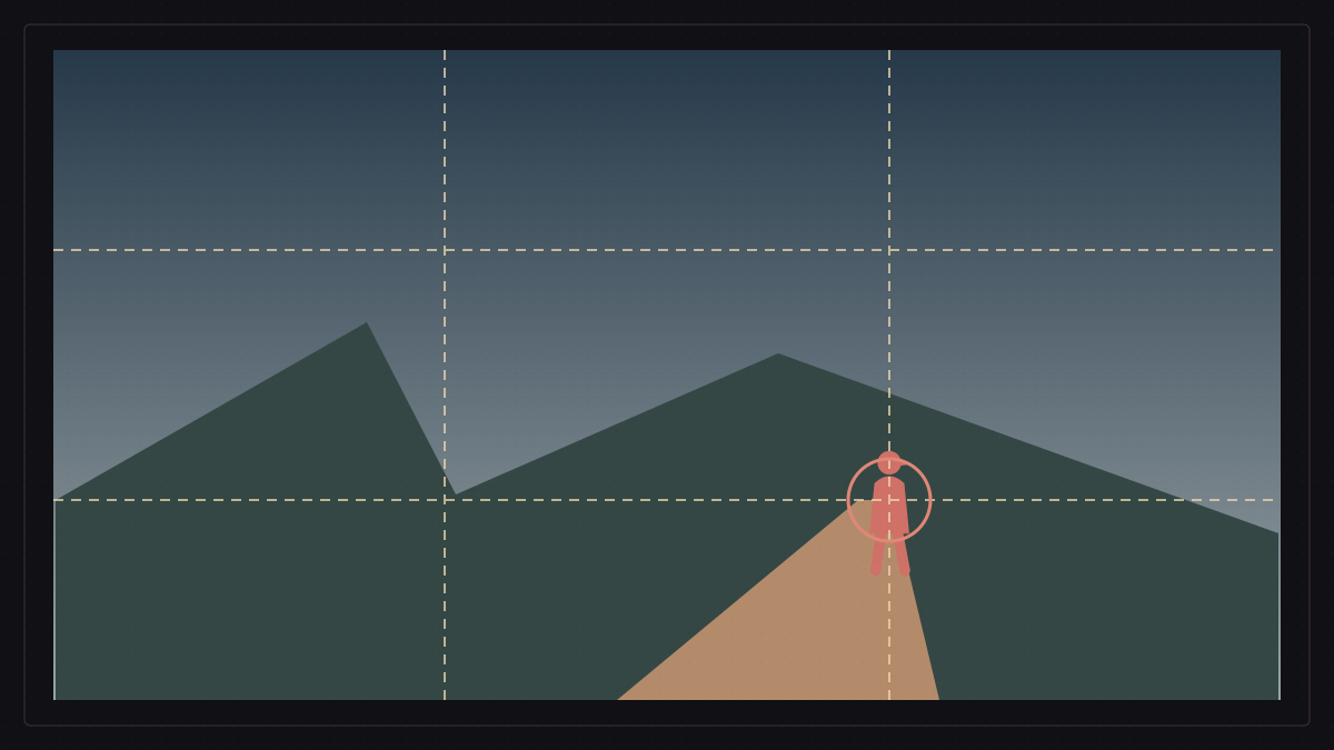
One familiar tool is the rule of thirds. Imagine two vertical and two horizontal lines dividing the image into nine areas. Their intersections offer possible places for important elements, rather than always putting everything in the centre.
The grid can produce an off-centre distribution and leave room for other elements to breathe. It is useful as a way to think, especially when deciding how to share the frame between a subject and its surroundings.
The problem begins when a tool becomes a commandment. Placing a character on an intersection is not automatically right, and placing one in the middle is not automatically wrong. The rule of thirds is a helpful organising grid, not the governing law of every cinematic image.
Sometimes moving away from the centre is strongest; sometimes nothing is stronger than a person precisely at its heart. Meaning decides.
Balance is not identical halves
It is easy to confuse balance with symmetry. Symmetry makes the two sides of a frame similar or nearly identical, often around a central axis. Balance is broader: unequal things can still counterweight one another.
A large person on one side might be answered by a smaller but more striking object on the other, or by several elements that carry comparable visual weight. The shot need not be a mirror to feel held together.
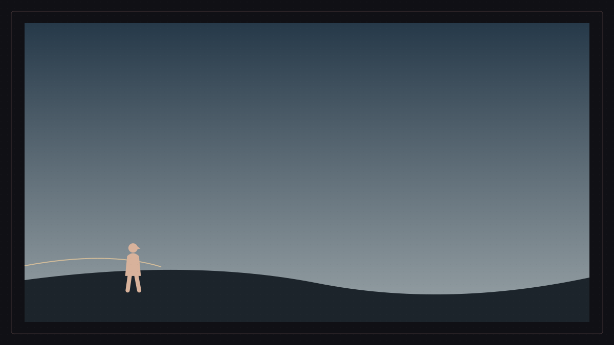
Composition deals with the weight things gain within an image, not only their actual size. A small isolated figure in a vast empty place can become the centre of our attention.
A frame may also contain many details while still leading the eye to one thing. The image's organisation, rather than its count of objects, tells us where to look.
Why does Wes Anderson favour the centre?
Wes Anderson offers a clear example of symmetry and central composition becoming part of an image's identity. Characters, doors, furniture and architectural lines often seem placed with unusual precision.
The result is more than a pleasing symmetrical picture. That visual discipline gives his world something of a dollhouse quality: ordered, constructed and visibly arranged within a larger design.
The lesson is not to copy the appearance without understanding its purpose. Putting a character in the middle simply because Anderson does it teaches us very little about composition.
Ask instead what the centre or that strict order adds to a particular scene's feeling. That is where thinking in images begins.
Lines that lead the eye through the frame
Not every important element sits at a chosen point in the frame. Sometimes what matters most is the route the eye takes. Leading lines can come from a road, wall, table edge, row of columns or a building's geometry.
Those lines can gather attention around a point or draw us from the foreground toward the depth of the image. Their force lies in directing the act of looking.
The viewer rarely says, 'That is a leading line.' They simply follow the arrangement. The movement can be felt before it is named.
It is one of visual storytelling's strengths: the image can guide attention before we consciously notice how it has done so.
When the lines meet at one point
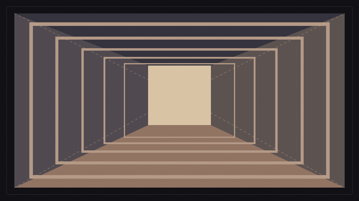
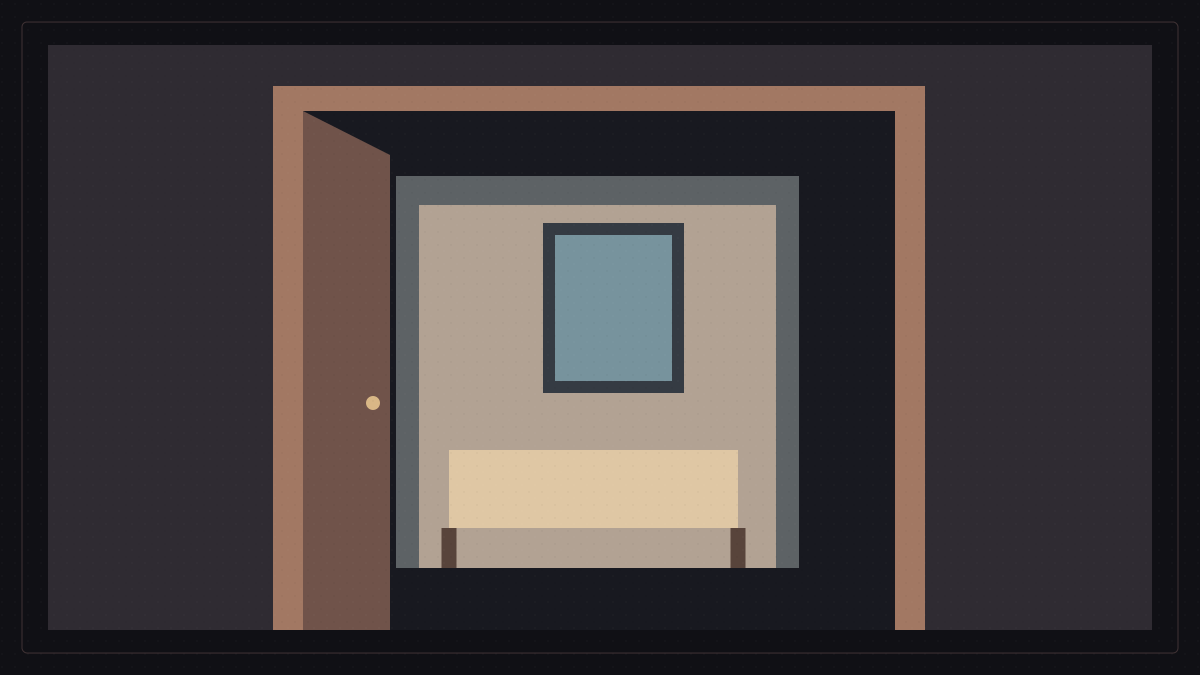
A powerful geometric form is one-point perspective. The lines of a place appear to extend into depth and meet at a single vanishing point. A long corridor, row of doors, walls or ceiling can create this structure.
Place a character near that point and the architecture itself seems to point toward them. No arrow is needed; the geometry does the work.
Central, symmetrical compositions have often been associated with Stanley Kubrick. We need not claim that they produce one documented physiological response. We can observe something clearer: converging lines give the frame a strong sense of control and make its depth unusually present.
The dramatic effect still depends on context. The same order might feel reassuring in one moment and oppressive in another. The tool remains the same; the meaning does not.
A frame within a frame
A filmmaker can also create a frame within the frame. A doorway may surround a character, or we may see them through a window, a mirror, a narrow opening or a gap between foreground objects.
The screen remains the outside rectangle, but another boundary appears inside it. We now see the person through an additional visual limit.
That inner frame can isolate a character, direct our attention or make them seem confined to a smaller part of the world. The effect comes from where the person stands in relation to the surrounding structure.
The place is no longer merely a background. Its boundaries become part of the story.
Headroom: small distances change the feeling
Headroom is the space between the top of a person's head and the upper edge of the frame. A very large gap may leave them looking lost near the bottom of the image; a very small one can make the shot feel compressed.
There is no magic measurement for every shot. The principle can help us find an easy visual distribution when a scene needs one.
If a scene calls for closeness or suffocation, reducing that space may be exactly the choice that gives it force. The convention can be bent for a reason.
The problem is not breaking a rule. It is breaking one without knowing what changed when we did.
Looking room: when empty space begins to speak
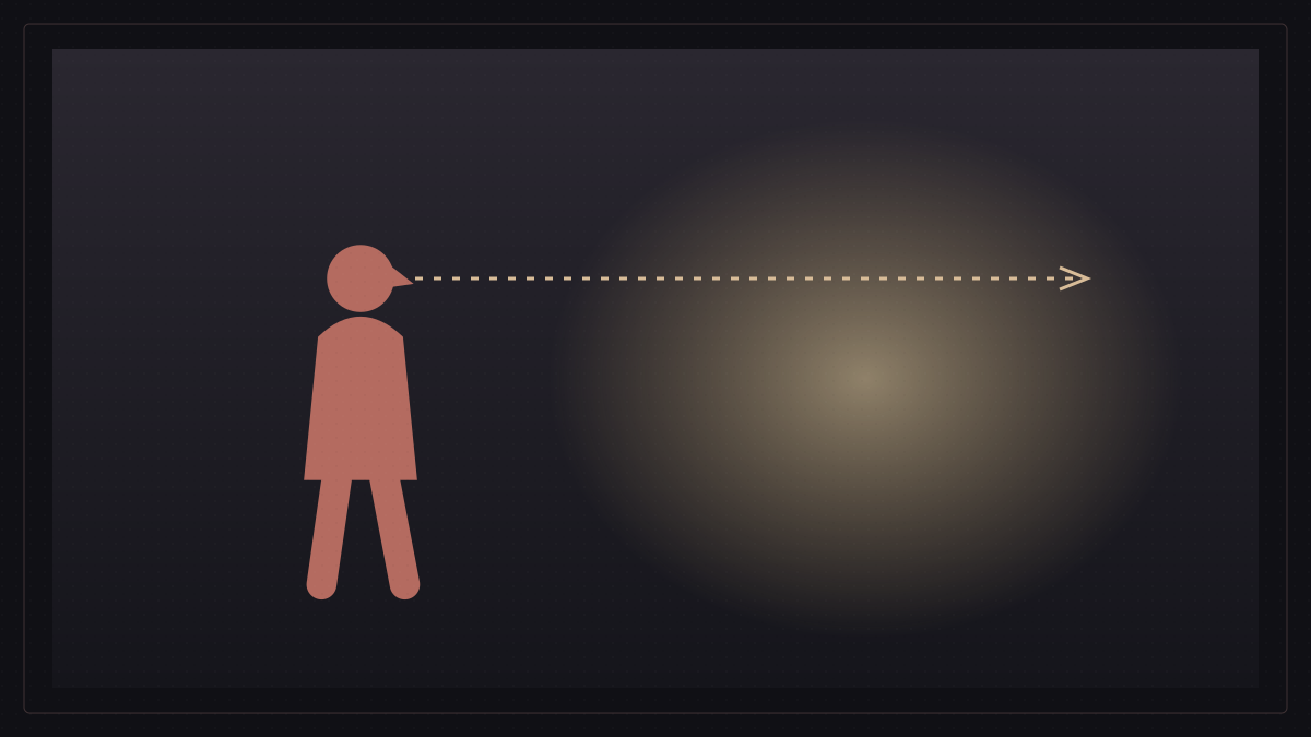
A similar principle applies to looking room, or movement room, when someone faces one side of the image. A person looking right is often given space in that direction; their gaze has somewhere to travel inside the frame.
Now place the face close to the right edge and leave the large empty area behind them. The relationship reverses. The gaze runs into the boundary instead of opening outward.
That change can suggest pressure, blockage or discomfort. These are possibilities shaped by the rest of the scene, not guaranteed emotions assigned to a measurement.
Looking room remains a guide rather than a law. Violating it deliberately does not automatically make a shot a mistake.
The image is not a flat surface
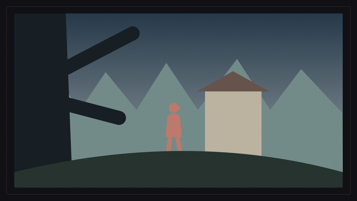
The screen is flat, but composition can make us feel real distance between elements. One simple method is to think in layers: foreground, middle ground and background.
Place an object near the camera, a person farther back and another action behind them. The shot is suddenly more than a figure in front of a wall. Storytelling can operate on several levels inside one space.
We might see something happening in the background that the foreground character has not yet noticed. Or the layers can connect two people, or keep them apart, without moving either one out of the shot.
Three layers are not an achievement in themselves. Depth matters when it serves the story.
In Parasite, a wall is not just a wall
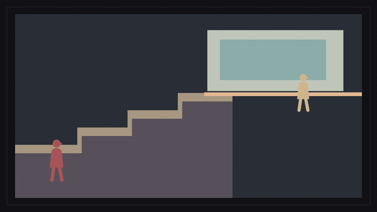
Parasite offers an example of how class and space can appear in a frame's divisions. Architecture, or a part of the setting, can create a visible boundary between characters who inhabit different social worlds.
A line across a room is then more than part of the building. It can be read as a visible relationship: one group occupies one part of the image, another group the other part.
Space belongs to one side and is not crossed as freely by the other. The arrangement turns an abstract idea into something that the eye can locate.
Class is a concept; the boundary in the image can be seen. Composition becomes especially cinematic when it can turn an invisible idea into a visible relation within the frame.
A rule matters when we choose to break it
Learning compositional rules is useful. Treating them as a list of offences defeats their purpose. A person need not stand on a grid intersection, a horizon need not always be level, headroom need not remain identical and symmetry is not superior to asymmetry.
Each arrangement offers a different result. Before filming, the useful question is not, 'Which rule must I use?' It is: 'What should the viewer see and feel, and which arrangement serves that?'
Perhaps the shot needs balance; perhaps imbalance is its meaning. We can leave room for a person to breathe or take it away. We can make them the centre of their world or push them toward its edge.
A rule becomes most useful when we understand the effect of changing it. Then breaking it becomes a decision rather than an accident.
The frame interprets the story
Part one followed cinema to the point at which it could record an image and movement. The ability to record is not yet a visual language; that language emerges when a filmmaker decides how to present what was recorded.
Framing chooses the world's boundaries. Composition arranges what remains inside. Lines guide the eye; empty space isolates or compresses; centre and edge change a character's weight; depth lets more than one relationship exist at once.
Yet another question remains. We have asked where elements belong inside the image, but where did those elements come from? Who selected the room, furniture, clothes and colours? How can a place tell us who lives there before anyone speaks?
Here we leave the geometry of the frame and begin to build the world in front of the camera. To be continued in part three: mise-en-scène—what does it mean to place a world before the camera?
About this series
This series begins with the origins of moving pictures, then explores framing, light, lenses, composition, and the choices that give an image meaning.
All parts of this series are now published.
All Cinema Journal articles